


Gokul rendered as a digital AI portrait

Gokul Anilkumar

Design Lead | Built & Scaled 900-Person Org | ex-CDO | Fintech | Gov | AI in Design

I make complex products feel simple.

I design AI, fintech, and enterprise experiences where business goals, technology, and human behavior meet.

Experience

12+ years turning complexity into clarity.

I've designed across AI, fintech, enterprise software, government platforms, travel, and operational systems — from early strategy through launch.

My focus is always the same: make the product easier to understand, trust, and adopt.

12+ Years

Building digital products

350+ Projects

Across industries and markets

Enterprise to Startup

From strategy to execution

Abstract iridescent AI assistant form

How I Think

People first.
Systems always.

Great products are not built around feature lists. They are built around how people think, decide, and move through a system.

I design for

01behavior
02systems
03workflows
04adoption
05outcomes

The goal: every important moment should feel obvious.

What I Bring

I connect strategy, systems, AI, and execution.

Four strengths. One connected product practice.

01

Direction

Product Strategy

Turning ambiguity into clear product direction

02

Architecture

Systems Thinking

Designing connected experiences, not isolated screens

03

Interaction

AI-Native Design

Building products for the next generation of interaction

04

Launch

Execution

Taking ideas from concept to launch

I bridge business goals, user needs, and technical reality — then ship.

Continuous Learning

Better products start with better questions.

I keep sharpening how I connect human insight, business strategy, and product viability.

Stanford Graduate School of Business — Executive Education

Design Thinking: From Insights to Viability (2022)

Stanford Graduate School of Business Design Thinking certificate
Photo 01

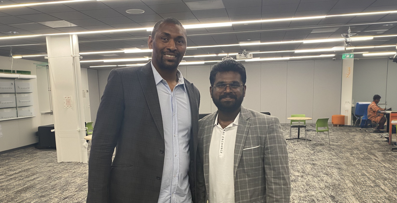
Product Manager and Designer of ex-NBA player Metta World Peace

1 / 7

KwikPay customer using a mobile payment experience

Case Study 01 · National Payments

KwikPay

Changing how Kuwait pays, moves, and manages money every day.

Consumer Wallet · Merchant Platform · RFID Mobility · Payroll · Remittance

A national product vision designed to turn digital payment into an everyday habit.
KWIKPAY / 01

The Vision

We weren't building another wallet.

We were building the digital payment layer for Kuwait.
One ecosystem. Multiple products. One experience.

Fuel
Parking
Retail
Restaurants
Payroll
Remittance
Government
Airport
KwikPay
KWIKPAY / 02

The Behavior Challenge

Kuwait already pays.
The habit had to change.

The opportunity was not another payment feature. It was earning enough trust and convenience for people and merchants to choose digital payment every day.

Cash
Cards
Parking
Fuel
Payroll
Bank
Wallet
RFID
POS
One daily payment habit
KWIKPAY / 03

Product Ecosystem

One product quickly became seven.

01

Consumer Wallet

02

Merchant POS

03

Merchant Dashboard

04

Payroll

05

Remittance

06

RFID Mobility

07

Admin Platform

A single design language connects every product, role, and payment moment.
KWIKPAY / 04

Product Vision & Leadership

Turning payment infrastructure into a behavior people choose.
I shaped the product vision across customers, merchants, regulators, mobility, payroll, and operations—aligning the ecosystem around adoption, trust, and national-scale growth.

National Vision
Consumer Adoption
Merchant Growth
CBK Trust
Mobility
Payroll
Partnerships
Operations
Research
Strategy
Product Vision Lead
KWIKPAY / 05

Behavior Change Strategy

Make digital payment easier than the habit it replaces.

Every payment rail had to reinforce the same promise: accepted everywhere, instantly understood, and always trustworthy.

Cash-first behavior
Fragmented payment moments
Merchant hesitation
Trust barriers
Everyday Utility
Visible Trust
Merchant Adoption
Repeat Behavior
KWIKPAY / 06
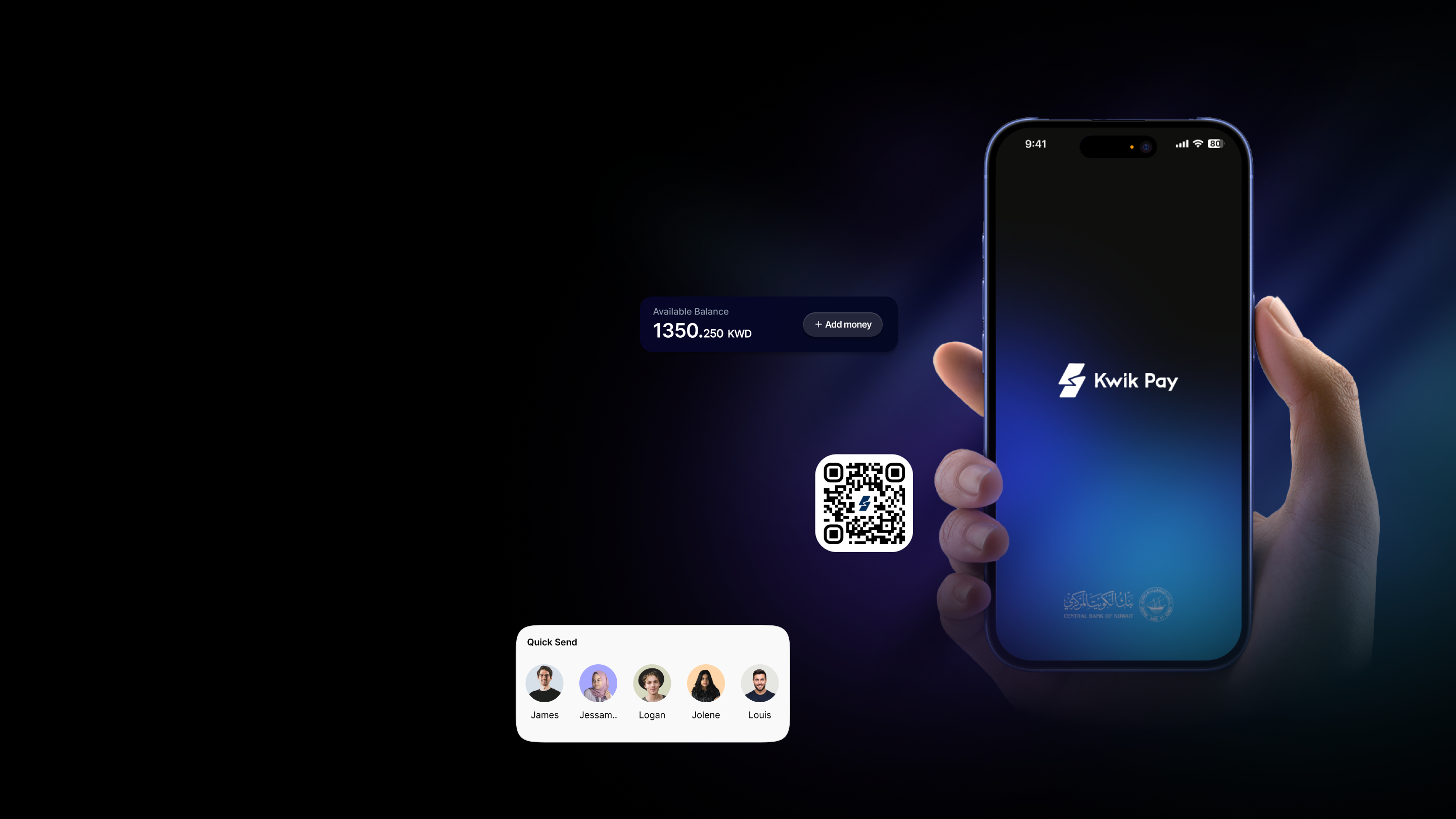
KwikPay app experience shown on a phone with payment interface elements

Consumer Experience

Everything a customer needs.
Nothing they don't.

A focused wallet experience for balance, quick send, QR payments, and daily payment confidence.

KWIKPAY / 07

Merchant Experience

Merchants don't have time to think.

Every second matters.

01

Merchant POS

02

RFID Scan

03

Payment

04

Receipt

05

Dashboard

KWIKPAY / 08

RFID Mobility

Your Car Becomes
Your Wallet

The payment disappears. The experience remains.

RFID VERIFIED
KWIKPAY / 09

Enterprise Platform

The infrastructure behind every effortless payment.

Merchant Management

Payroll

Analytics

Employees

Settlements

Reports

Devices

Roles & Permissions

KWIKPAY / 10

Designing Trust

Money moves because people trust it.

Trust isn't added later. It's designed into every screen.

01

Pending

02

Processing

Successful

04

Receipt

05

History

06

Notifications

KWIKPAY / 11

Scale

1

National Payment Ecosystem

7

Major platforms

100+

User journeys

Consumer + Merchant + Enterprise

QRRFIDPayrollRemittanceAnalyticsPOSAdministration

One coherent system designed to operate across a country's daily financial life.

KWIKPAY / 12

Leadership Reflection

“The real product was not the wallet. It was a new payment habit for Kuwait.”

KwikPay required product leadership beyond screens: a clear national vision, merchant adoption, consumer trust, operational alignment, and an ecosystem useful enough to become part of daily life.

Gokul

Product Vision Lead

KWIKPAY / 13
Blue cinematic insurance platform concept with protected delivery vehicle

Case Study 02

InShare

Insurance Platform for the On-Demand Economy

A digital-native MGA platform that prices risk, manages fleets, and settles claims — built for rideshare, delivery, and gig work.

Platform Problem

How might we turn insurance — a top-3 operating cost for on-demand companies — into a platform they can see, manage, and trust?

Traditional commercial insurance for gig and fleet businesses ran on static spreadsheets, annual policies, and opaque pricing.

InShare's bet was that real-time telematics + machine-learning risk scoring could replace that, but only if the data was made legible.

My job was to design the interface layer that turned a complex risk engine into something underwriters, brokers, and enterprise admins could actually operate.

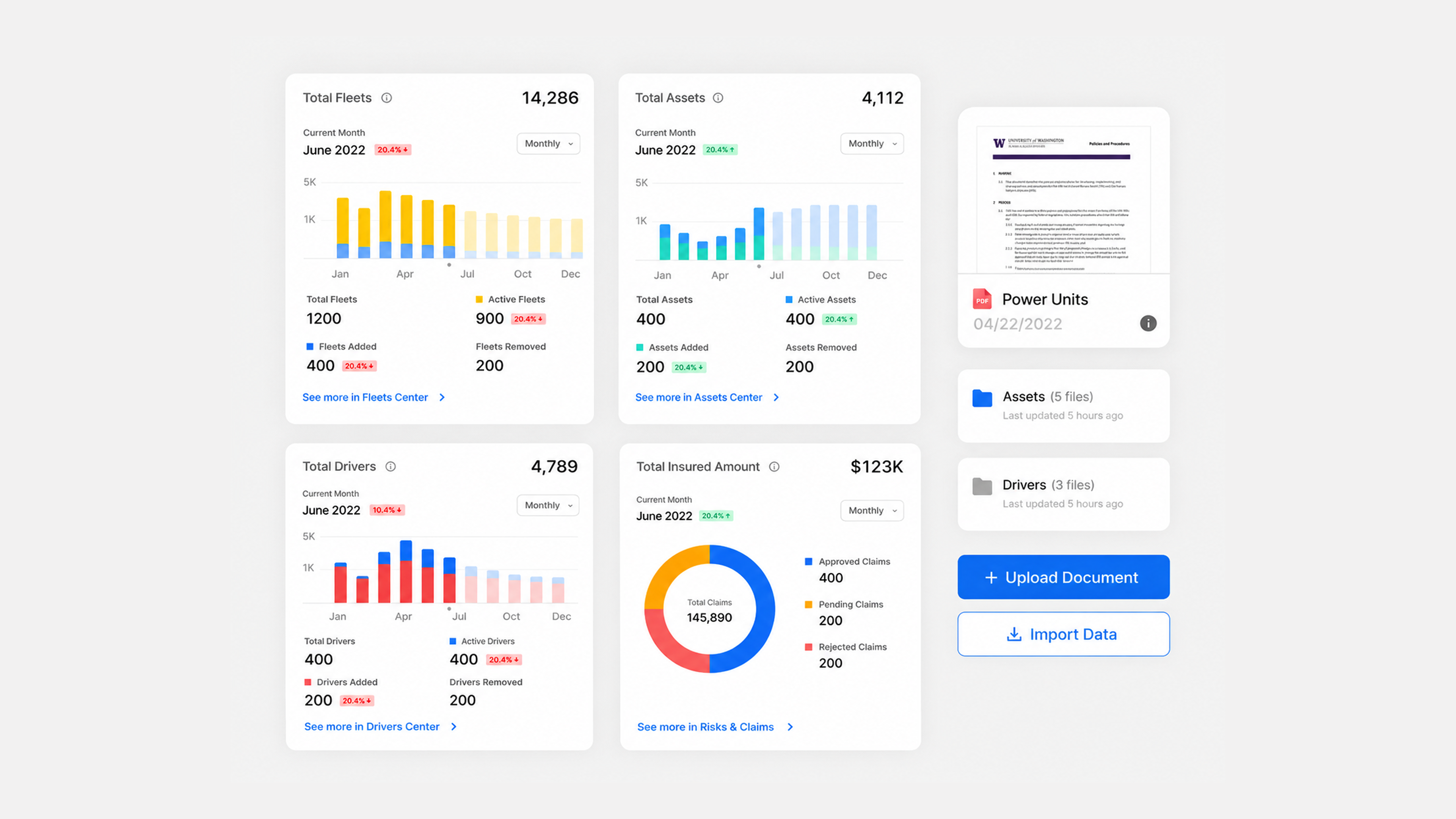
InShare admin dashboard modules and document upload interface

InShare

Designing the platform layer around complex insurance intelligence.

My Role

Product Designer (UX/UI)

Information Architect

Design System

Responsibilities

Admin Portal · Dashboard

Data Visualization

Fleet / Claims Workflows

Deliverables

Insurance Admin Platform

Risk & Claims Dashboards

Self-Serve Analytics

Build — Data science & ML risk engine built by InShare's engineering team; I designed the platform and how its data surfaced to users.

$7.5M seed · 2019 founded · $20B insurance TAM · Scottsdale, AZ

System Thinking

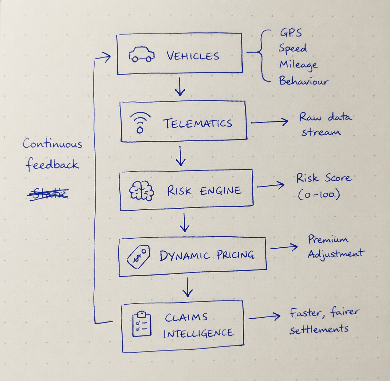
I designed for a platform that turns raw telematics into priced risk.

01

Mapped the full data flow: sensors -> data lake -> ML risk engine -> dynamic pricing -> claims.

02

Designed the interface layer that made an opaque pipeline legible to underwriters, brokers, and enterprise admins.

03

One platform serving four distinct user types — each needed a different view of the same data.

Hand-drawn InShare telematics risk engine system flow

Research & Insights

Three insights shaped the platform.

01

Insurance buyers fly blind

They need real-time visibility into fleets, claims, and loss.

02

Data is the product

Surface risk scores and analytics; don't hide them in PDFs.

03

Every role sees risk differently

Admins want totals, underwriters want segments, brokers want status.

Design Approach

A frictionless, digital-first portal — built around clarity at a glance.

01

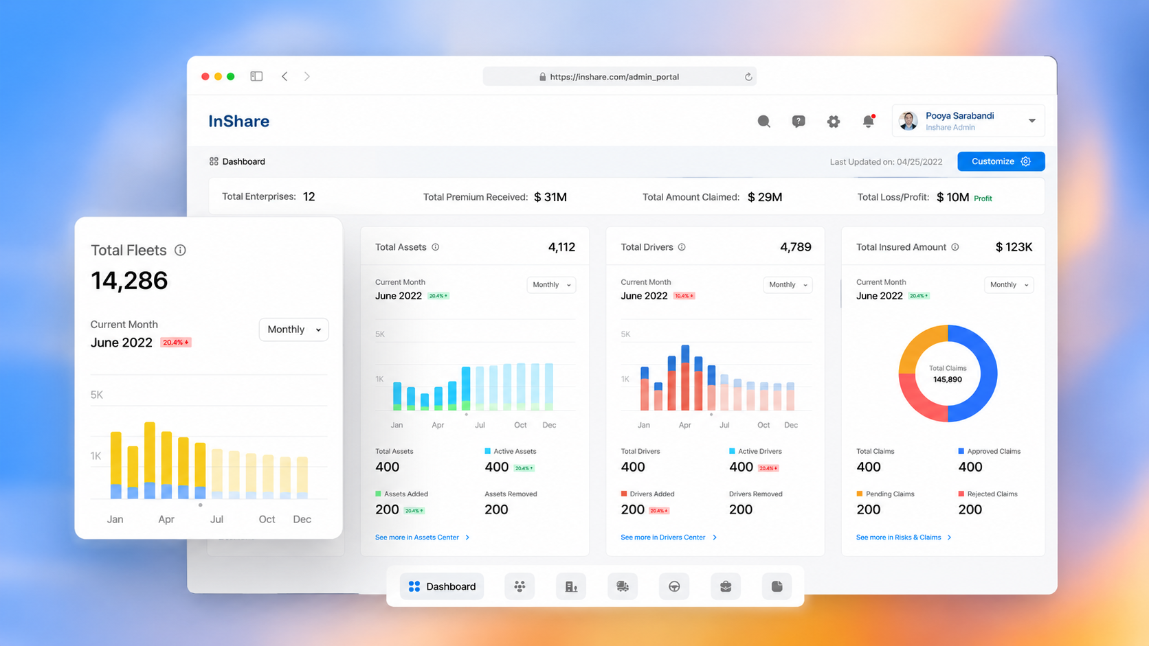
Dashboard-first: the most important numbers (premium, claims, loss/profit) above the fold.

02

Modular "Centers" — Fleets, Assets, Drivers, Risks & Claims — so each team has a home.

03

API-driven, real-time data with self-serve analytics, no waiting on a broker.

Solution Architecture

One admin platform, four connected centers.

Dashboard

Enterprise-level KPIs: premium, claims, loss/profit, insured amount.

Fleets & Assets Centers

Track active, added, and removed units with monthly trends.

Drivers Center

Driver counts, activity, and risk over time.

Risks & Claims Center

Claims breakdown: approved, pending, rejected, with a live ratio.

The ML risk-scoring engine was built by engineering; I designed the data-visualization system, the IA, and every screen that exposed it.

Impact & Learnings

The real design problem was hierarchy, not charts.

Learning 01

Hierarchy, not charts

In data-dense B2B tools, deciding what not to show is the core craft. Every extra number costs the user attention. The dashboard works because it's ruthless about what earns the top of the screen.

Learning 02

Domain complexity drives the UI

Designing for underwriters meant learning insurance logic — loss ratios, segmentation, claims leakage — so the interface respected how they actually reason.

Learning 03

Model outputs need product design

Working with the data-science team, I learned to design around what the risk engine could reliably produce, not an idealized version of it.

Results

A platform foundation for a new insurance category.

$7.5M

seed-stage insurtech raised and brought its platform to market

$20B

insurance TAM across the on-demand economy

4 x 4

one system serving 4 user types across 4 product Centers

GTM

supported go-to-market with Amazon, Skyward Specialty, and Snapsheet

InShare admin dashboard interface with insurance analytics cards
Surreal phygital gallery landscape for Nuuway NFT marketplace

Case Study 03

Nuuway

NFT Marketplace · Phygital · Giving Back

A creator-first marketplace where every trade gives back — built across two blockchains.

Web3 · Product & Visual Design

How might we make a feature-dense, multi-chain NFT marketplace feel as effortless as a mainstream store — and mean something?

Most NFT platforms in 2022 were intimidating: wallet-first, jargon-heavy, and indistinguishable from one another.

Nuuway's brief was different — a marketplace built on a “giving back” mission for creatives, supporting both digital and physical assets, across Ethereum and Solana, for users who may have never touched crypto.

My job was to design an experience that hid the blockchain complexity behind a confident, editorial interface.

Nuuway

Designing the marketplace layer for creators, collectors, and phygital assets.

03

My Role

Lead UX/UI Designer · Information Architect · Design System owner

Responsibilities

Marketplace flows · Creator & asset-minting UX · Auction & checkout · Visual language

Deliverables

Explore · Asset & auction pages · Create-Asset flow · Profile / collection · Design system

Build — Engineered by Accubits using ReactJS, Node.js, and PostgreSQL. I owned the end-to-end experience and interface; the team built the smart-contract and multi-chain integration.

2 blockchains · 3 user modules · 3 payment rails · 4 languages

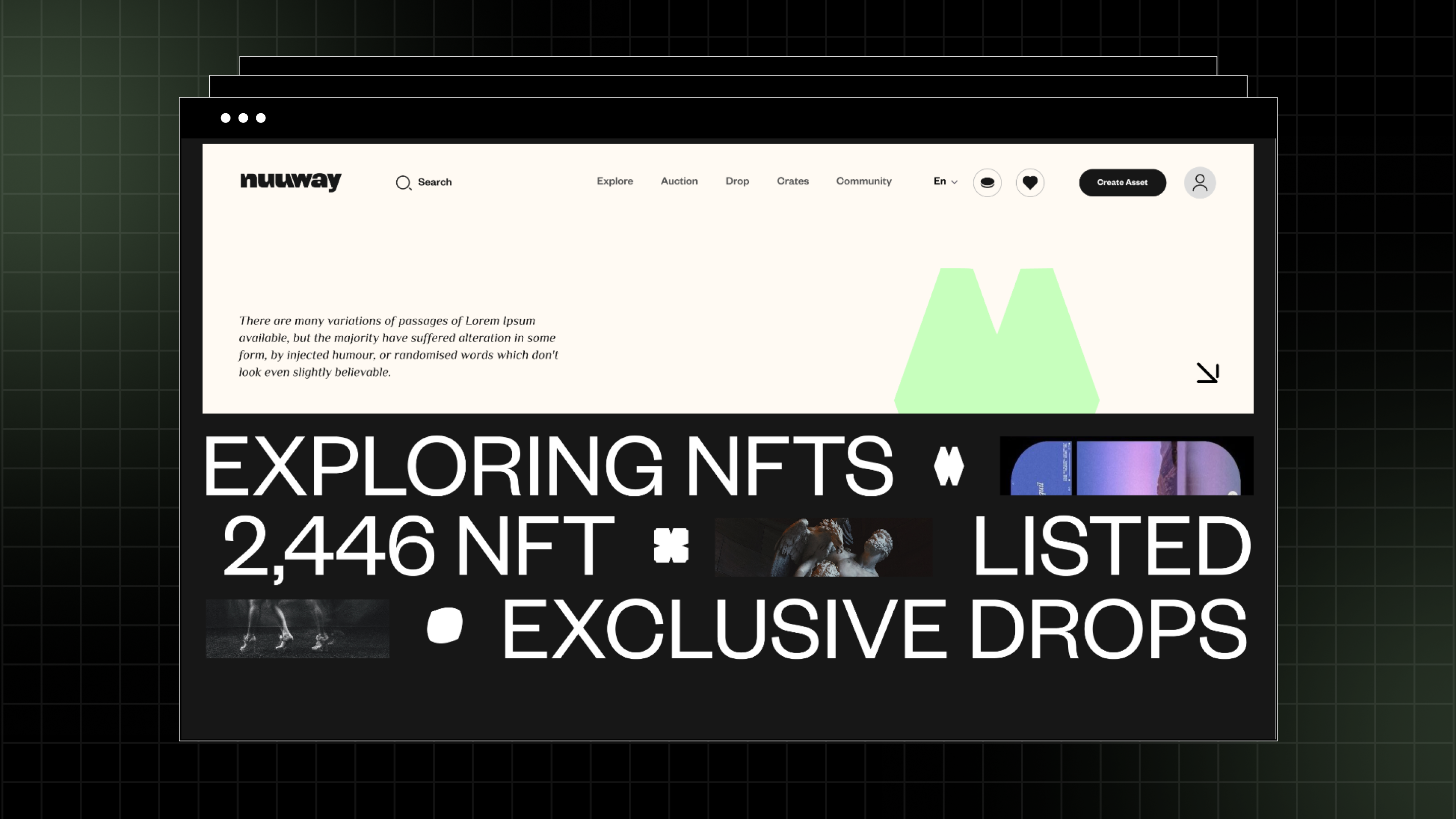
Nuuway NFT marketplace visual with listed NFTs and exclusive drops

Business Context

A creator-first marketplace with a mission baked into the economics.

Unlike speculative-trading platforms, Nuuway was designed around supporting creatives and giving back; a fixed percentage of every NFT purchase is routed to good causes.

The product had to serve three audiences at once: collectors who browse and buy, creators who mint and earn royalties, and an admin who curates and governs the marketplace.

Collectors browse and buy
Creators mint and earn royalties
Admins curate and govern

Built to bridge Web2 and Web3: fiat and internal wallet for newcomers, full on-chain control for crypto-native users.

System Thinking

I designed one marketplace that speaks to three roles and two chains.

01

Mapped Customer, Creator, and Admin as distinct journeys with a shared asset spine.

02

Designed chain-agnostic minting: Ethereum or Solana, with gas, standards, and confirmation abstracted into one path.

03

Accounted for dual wallets: Magic.link for Web2 users and Metamask / WalletConnect for Web3 users.

04

Treated phygital assets as first-class, threading shipping and order tracking into a crypto-native flow.

Research & Insights

Three insights shaped the whole interface.

01

Crypto-friction scares off newcomers.

Let users browse and buy under a threshold with no wallet, no sign-up; defer complexity until it is truly needed.

02

Creators need power without overwhelm.

A progressive Create-Asset flow: list type, details, chain, royalty, publish; one decision at a time.

03

A marketplace is only as good as discovery.

Explore uses faceted filters and clear categories so thousands of assets stay navigable.

Design Approach

A bold, editorial visual language over a calm, predictable structure.

Art first. Crypto quiet.

The interface gets out of the way of the work while keeping every transaction understandable.

High-contrast, gallery-like aesthetic: heavy display type, generous black space, art as the hero.
Auction and Fixed Price share layout and logic, so switching feels familiar.
Live countdowns, current bid, and bid history make auction state glanceable.
Cards, filters, modals, and forms standardized into a reusable marketplace kit.

Solution Architecture

One platform, three modules, end-to-end.

Customer

Wallet connect or skip, Explore, filters, asset detail, checkout, owned assets, gifting, wishlist, loot boxes, order tracking, donate.

Creator

KYC-gated minting, multi-chain Create-Asset, auctions, drops, royalties, community pages, blogs and vlogs.

Admin

Asset approval, user and commission management, drops, analytics, and content moderation.

Accubits engineered the smart contracts, chain integration, and Magic.link wallet; I designed the IA, every screen, and the interaction model connecting all three modules.

Product Experience

Discover → understand → bid or buy → own → give back.

A collector lands on Explore, filters by category, and opens an asset to see the artwork, creator, live auction state, and bid history.

A newcomer can buy without a wallet or sign-up below the threshold. A creator runs Create-Asset, choosing Auction or Fixed Price, uploading 3D, video, audio, or image, selecting Ethereum or Solana, and setting royalties.

Every purchase quietly routes a share to a good cause.

A design-led store, not a crypto dashboard.

Explore
Asset detail
Checkout
Give back

Impact, Learnings & Results

The craft was in hiding the complexity — not showing it.

Abstraction is the real Web3 design problem.
Mission has to live in the flow, not the marketing.
Unambiguous flows, states, and edge cases sharpened the handoff.

What shipped

2 blockchains (ETH + Solana) · 3 user modules · 3 payment rails · 4 languages

A full multi-chain marketplace spanning Customer, Creator, and Admin.

3 payment rails unified into one checkout: crypto, fiat, and Nuucoins.

Phygital support with order tracking in a single flow.

A reusable design system across Explore, auctions, minting, and profiles.

A giving-back model designed into every transaction.

Case Study 03 · Slide 12

Nuuway product motion preview

Click play

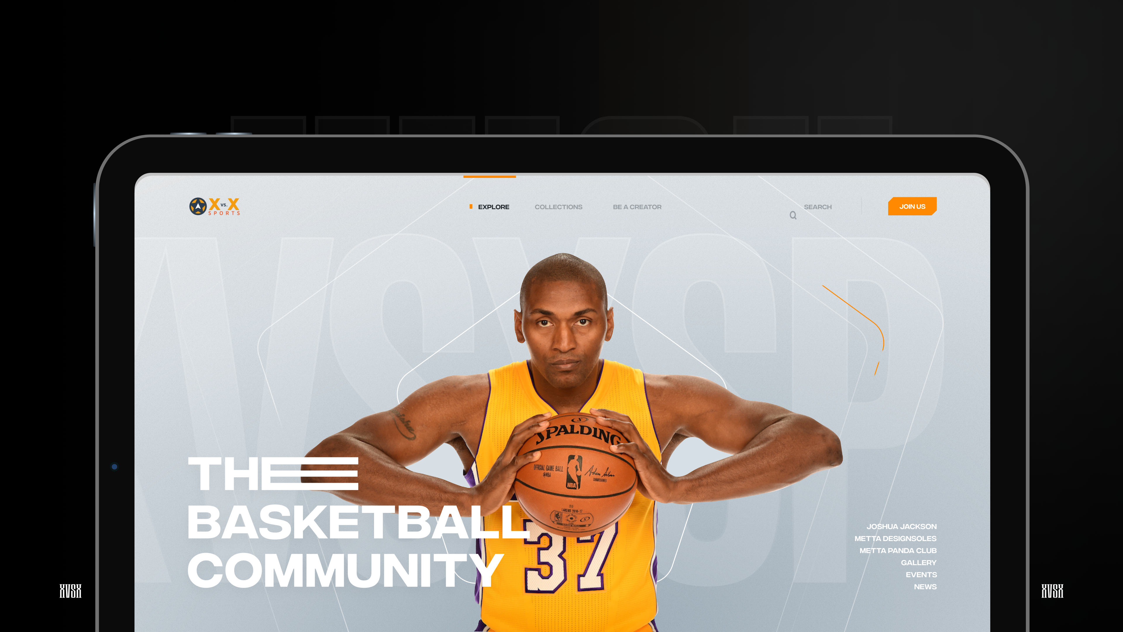
XvsX sports basketball platform cover

Case Study 04

XvsX

Sports & Social · Web3 · Product Design

The operating system for grassroots basketball — where pickup players, teams, and leagues live, compete, and get paid.

Sports & Social · Web3

A ball and a community beat a gang and a corner.

How might we give at-risk kids a reason to stay on the court — turning scattered pickup basketball into an organized, rewarding community with real teams, real stats, and a path that competes with the street for their time and identity?

Product Direction

1 NBA champion's vision, 1 designer, 7 roles, 6 modules.

04

Client

Metta World Peace

I served as his personal product manager and lead designer, owning product direction and every design surface.

I Designed

UX/UI · IA · Role Architecture

Mobile and web product surfaces, 60+ flows, and the design system across the ecosystem.

Build

Accubits / Anchain

Node.js, Swift, Kotlin, MySQL, XPS token backend, and NFT marketplace integration through Anchain APIs.

Duration: 6 Months

Mobile · Web · Token Backend · NFT Marketplace

XvsX basketball community web product screen

Business Context

A $13.2B fan-engagement market, pointed for once at the kids who need it most.

The grassroots player is an afterthought, and the at-risk grassroots player is invisible to the category entirely.

The behavior was already there to build on: sports organizations had adopted digital engagement tools, and fans were already using engagement platforms. The product's job was to redirect that proven pull toward community, not just commerce.

$4.8B

Fan-engagement market in 2025

$13.2B

Projected by 2034

~40%

Teams and leagues share in 2025

72%+

Fans using at least one engagement platform

XvsX inverted the premise: instead of monetizing pro fandom, use teams, leagues, stats, and rewards as a youth-diversion tool.

System Thinking

One identity that grows with the kid — spectator to player to leader.

Status ladder

1Spectator
2Player
3Team Creator
4League Creator

Persistent profile

Followers, badges, wallet, and stat history accumulate into an identity worth protecting.

Bucket capacity

Teams cap at 15; overflow routes to a bucket. The pattern repeats across teams, leagues, and players.

Shared wallet model

Personal, team, and league wallets use one interaction pattern for donations and creator-controlled splits.

Research & Insights

The street offers belonging. So should the app.

01

Fragmentation is the enemy.

Players juggle court-finders, ELO trackers, RSVP apps, texts, and still fight coordination friction.

02

Status must be earnable and visible.

Badges, awards, and verifiable stats give kids a positive identity to climb.

03

Community is the core loop.

The social and team layers sit at the center, not the marketplace.

Two problem spaces converged: disconnected pickup tools and the emotional pull of belonging, status, and structure.

Design Approach

Make showing up feel like leveling up.

Belonging as product architecture.

The product turns participation, profile setup, and team activity into visible progress.

01

Role-first onboarding scopes each kid's home to who they are.

02

Reward-gated profile completion turns setup into progress.

03

Earnable status appears through challenges, ranking badges, awards, and verified badges.

04

One pattern library keeps league-creator tools and a spectator feed feeling like one place.

Solution Architecture

6 modules engineered around one outcome: keep them coming back.

01

Belonging

Social

Feed, stories, chat, voice/video, and live streaming with live scores.

02

Status + structure

Competition

Teams, leagues, open runs, matches, invites, challenges, badges, and awards.

03

Real achievements

Stats & officiating

Stat Keeper and Scoreboard Keeper roles, template-based and time-gated.

04

Rewards + value

XPS token economy

Wallets, Stripe fiat on-ramp, peer transfers, donations with creator splits, coupons, and spin-to-win.

05

Ownership layer

NFT marketplace

Anchain platform, API-integrated, with view, buy, and resell via Dapper Wallet on Flow.

06

Safety + operations

Admin web console

Analytics, verification queues, sub-admins, CSV coupon campaigns, and moderation.

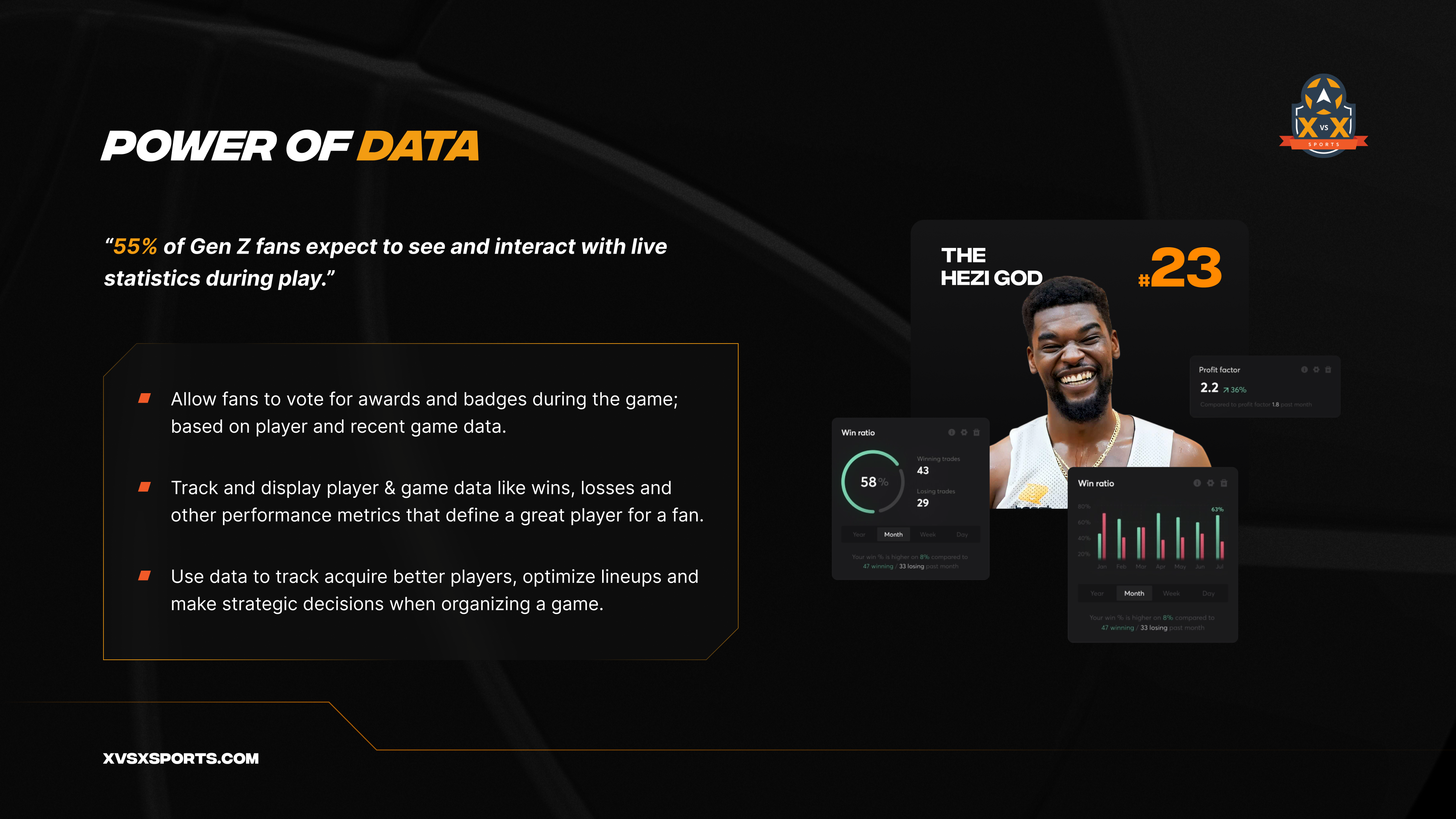
XvsX power of data basketball analytics product visual
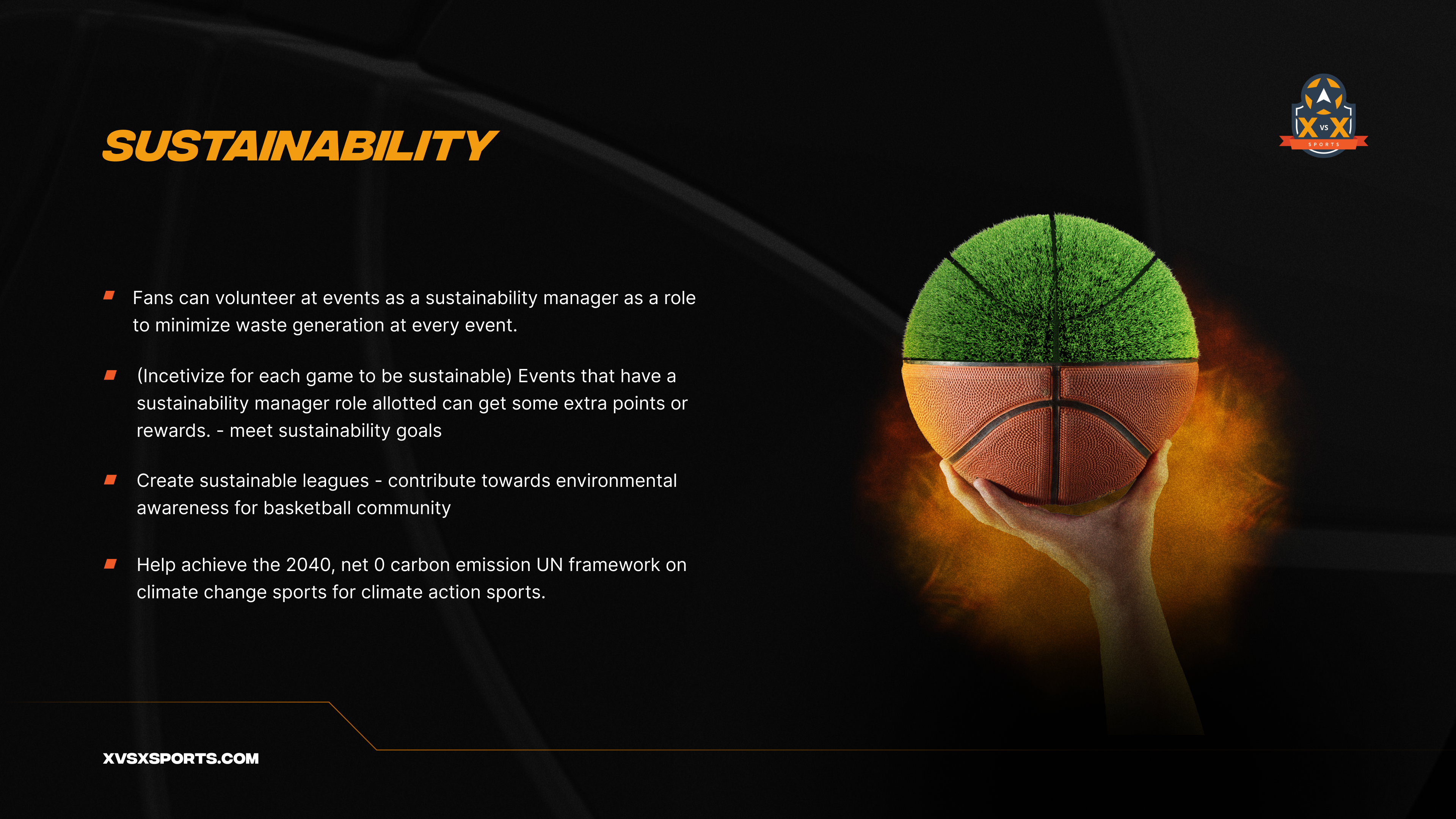
XvsX sustainability basketball community product visual
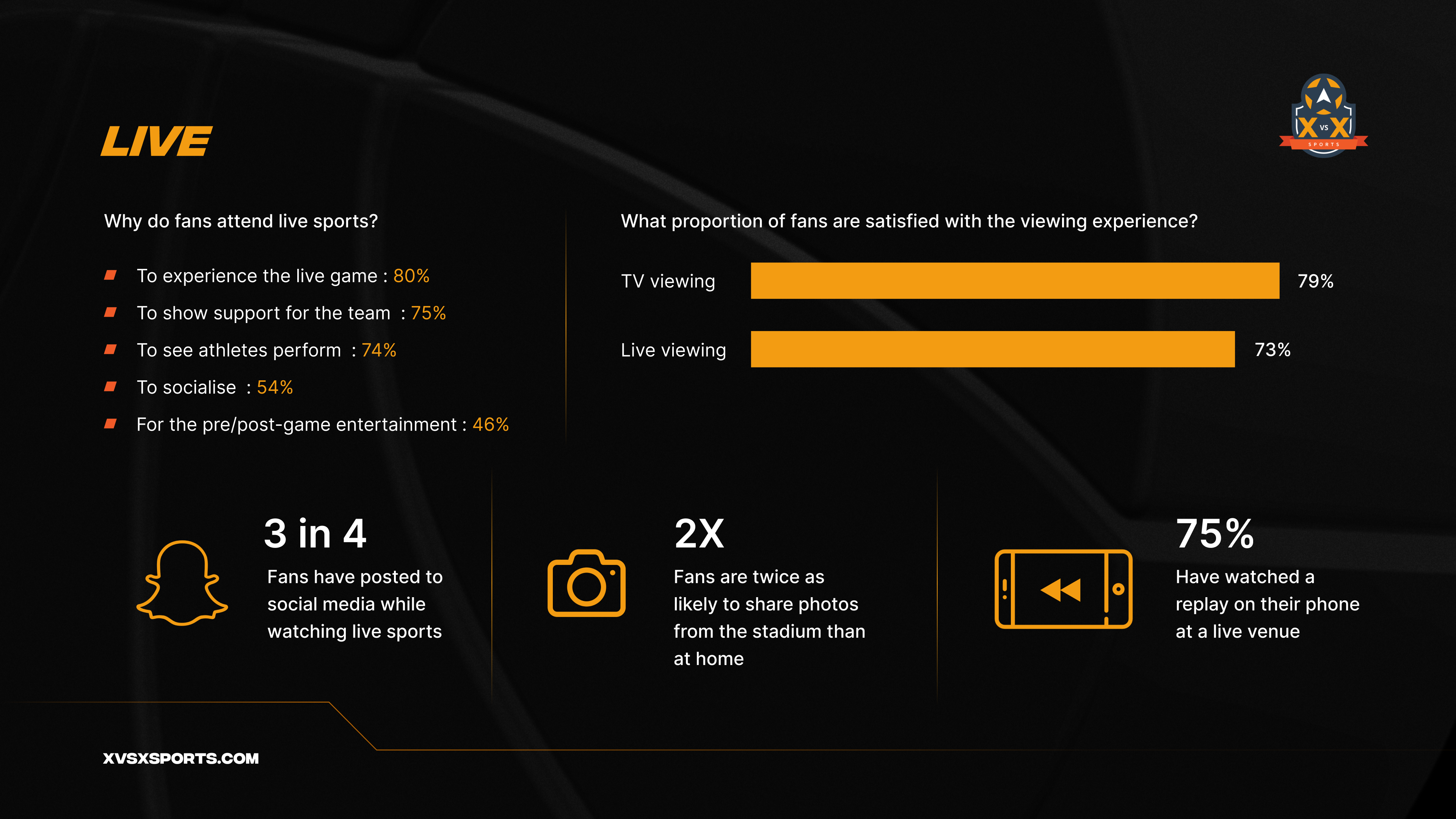
XvsX live sports fan engagement research visual
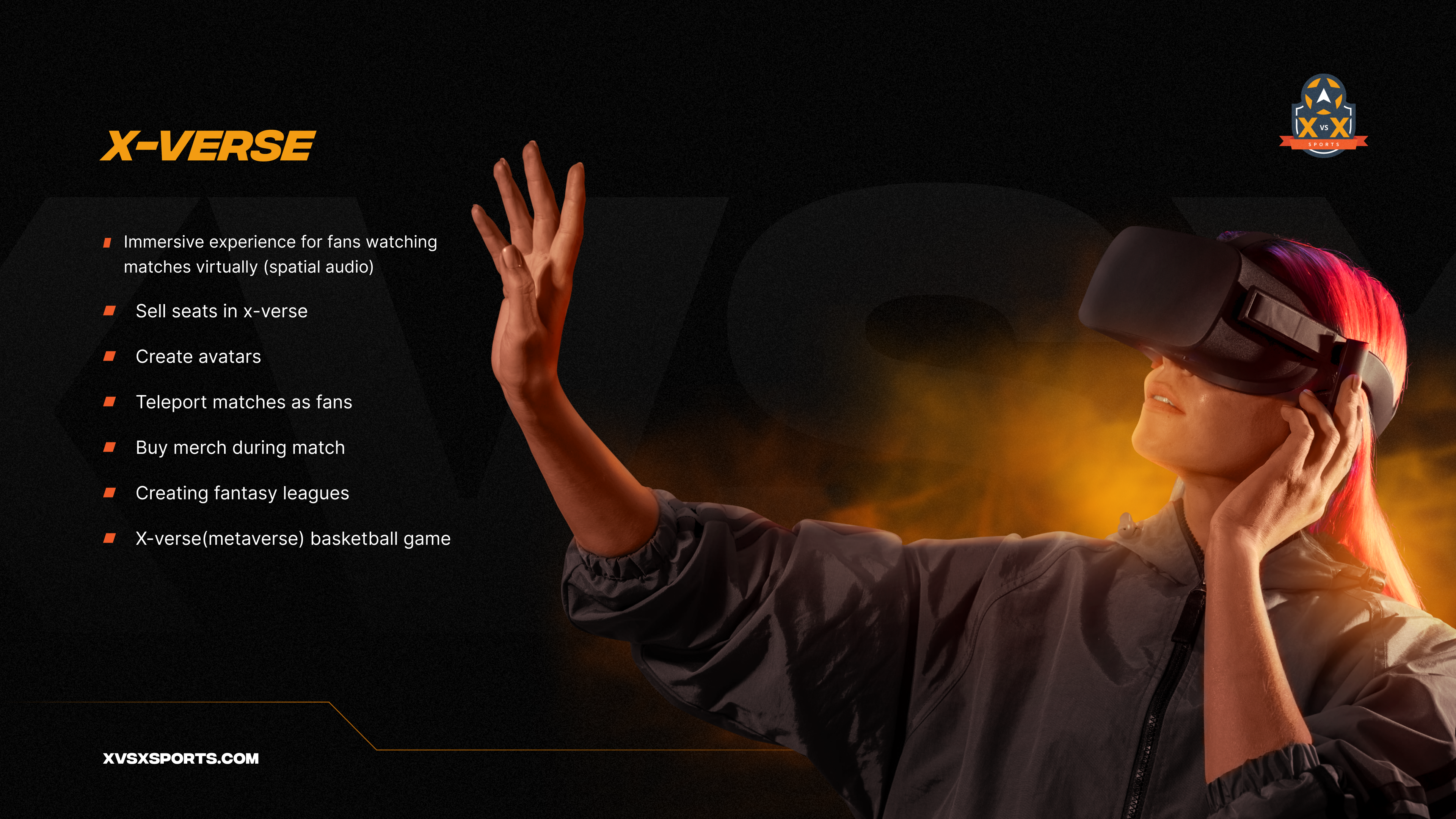
XvsX X-Verse virtual basketball experience visual
XvsX sports jersey brand identity visual
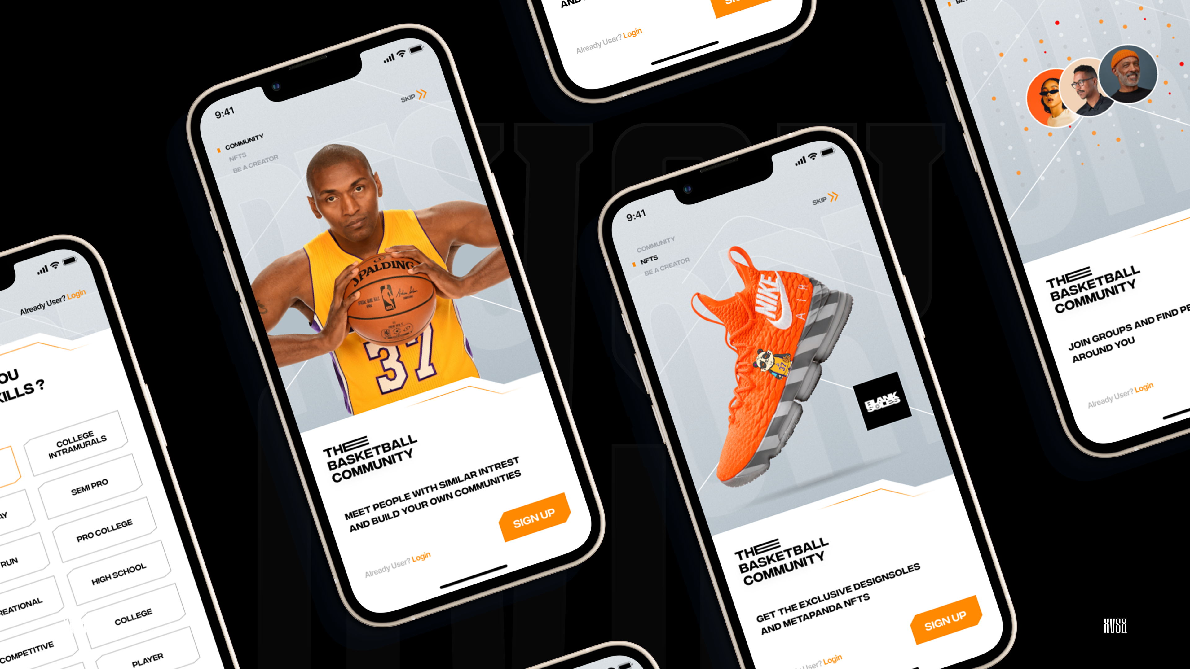
XvsX mobile app onboarding and marketplace screens visual
Dreamlike exhibition wayfinding structure in a field

Case Study 05

GITEX 2015 — 3D Wayfinding

A kiosk wayfinding and stall-discovery experience for the Middle East's largest technology exhibition. Helping 143,000 visitors find any stall — in seconds.

Experience & Spatial Design

How might we help 143,000 visitors find any one of 3,900 stalls across eight halls, without ever feeling lost?

GITEX 2015 packed roughly 3,900 exhibitors from 144 countries into the Dubai World Trade Centre over five days.

With that density, the hardest problem on the floor wasn't what to see; it was how to get there.

I designed a solution that turned a sprawling, disorienting venue into something a visitor could search, understand, and navigate in seconds.

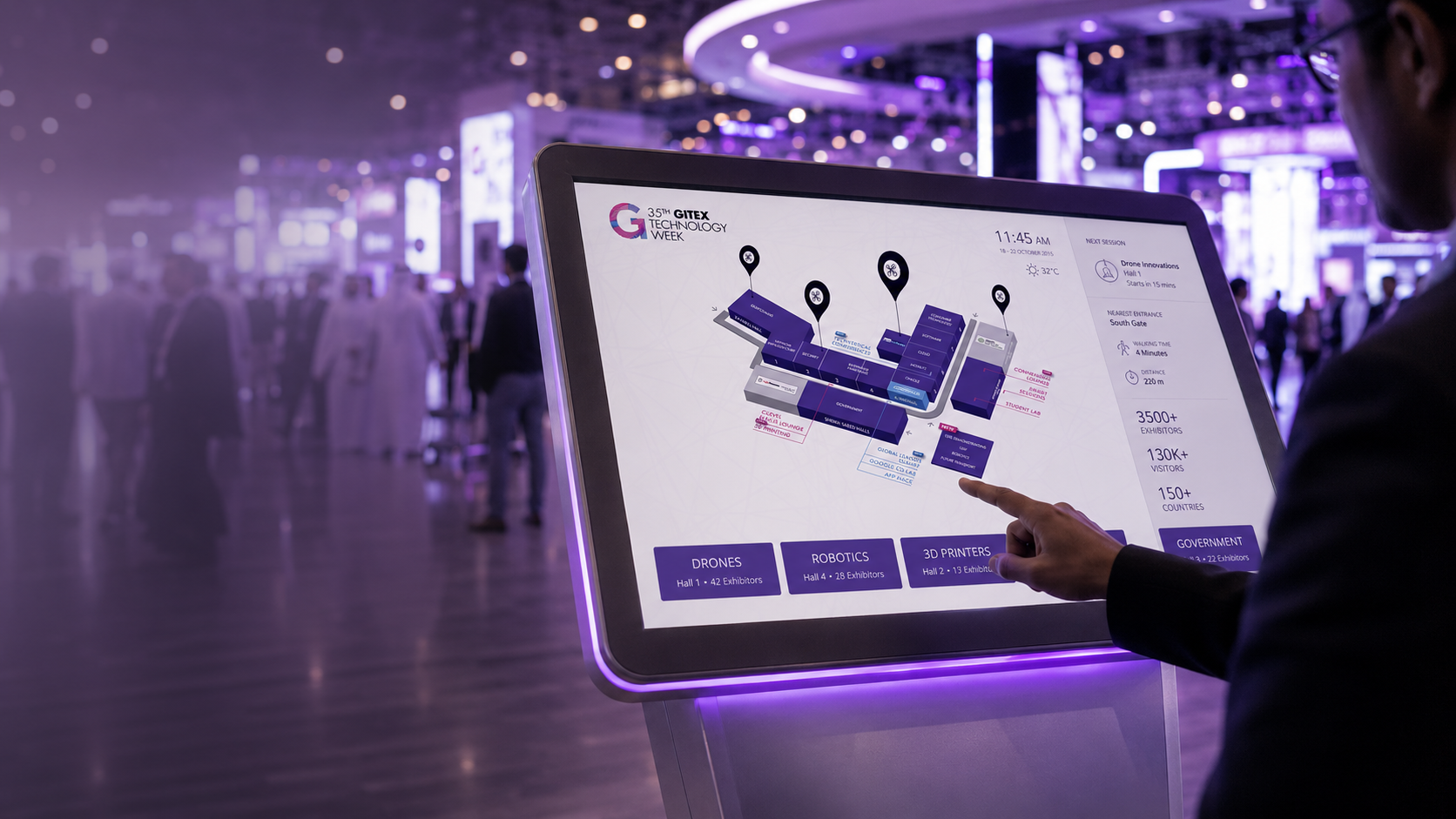
GITEX kiosk wayfinding interface in the exhibition hall

Design Approach

Search, view, navigate, preview.

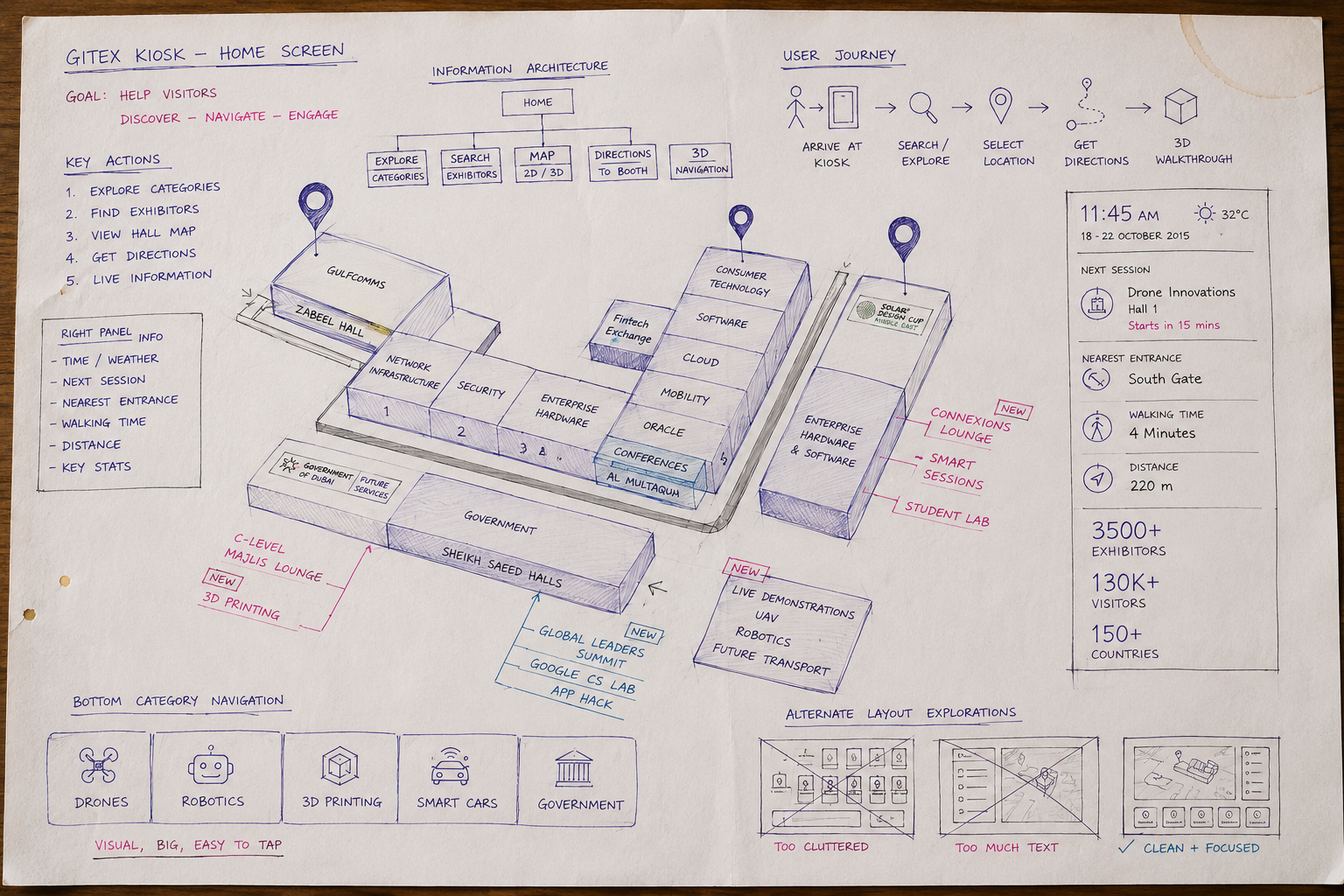
I designed around four core tasks: search, view, navigate, preview. The interface lets a visitor search any of the 3,900 stalls, open a detailed exhibitor profile, generate a route to that stall, and preview the journey as a third-person walkthrough video before setting off.

I prioritised large tap targets, legible-at-a-glance typography, and a calm visual hierarchy suited to a noisy, high-traffic environment where people interact for seconds, not minutes.

Hand-drawn GITEX kiosk design approach sketch

Solution Architecture

Four connected layers powered the experience.

01

Directory

Searchable index of all 3,900 stalls, built around spatial search over an exhibitor database.

02

Stall Detail

Profile, category, and pinpointed location, shown in a structure visitors could understand at a glance.

03

3D Wayfinding Engine

Point-to-point routing via an A* pathfinding algorithm over a navigation mesh of the venue.

04

Dynamic Walkthrough

A third-person, spline-based camera animation that previews the route as a video before you walk it.

Technical build by the developer; I designed the interaction model, screen flows, and how each layer surfaced to the user.

System Thinking

Four tasks. One flow.

Search

View

Navigate

Preview

01

Large tap targets and glanceable type for a 7-second, standing interaction.

02

Designed for a loud, crowded, high-traffic environment.

03

Kiosk-first patterns: attract loop, auto-reset, no login, instant search.

Impact & Learnings

Reduce the whole floor plan to the single next decision.

Learning 01

Spatial clarity is an interaction problem, not a graphic one.

Learning 02

A live 5-day event with zero room for failure forced radical simplicity.

Learning 03

Collaborating tightly with the developer taught me to design for the engine's constraints — pathfinding, render performance, level-of-detail — not against them.

Results

A dense exhibition floor became searchable, routable, and understandable.

Designed for fast decisions in a high-pressure public environment.

3,900

stalls indexed and made navigable

144

country pavilions mapped into one 3D model

8+

halls unified into a single searchable wayfinding system

143,000

visitors the experience was built to serve

Any-to-any

routing between any two points on the floor

~50

touchscreen kiosks deployed at hall entrances and junctions

GITEX wayfinding kiosk showing an interactive 3D map
Child exploring a luminous underwater world through a virtual reality headset beside a giant jellyfish

Selected work, from systems to immersive worlds.

A visual collection of AI-native products, enterprise platforms, interaction systems, and spatial experiences.

Explore selected work
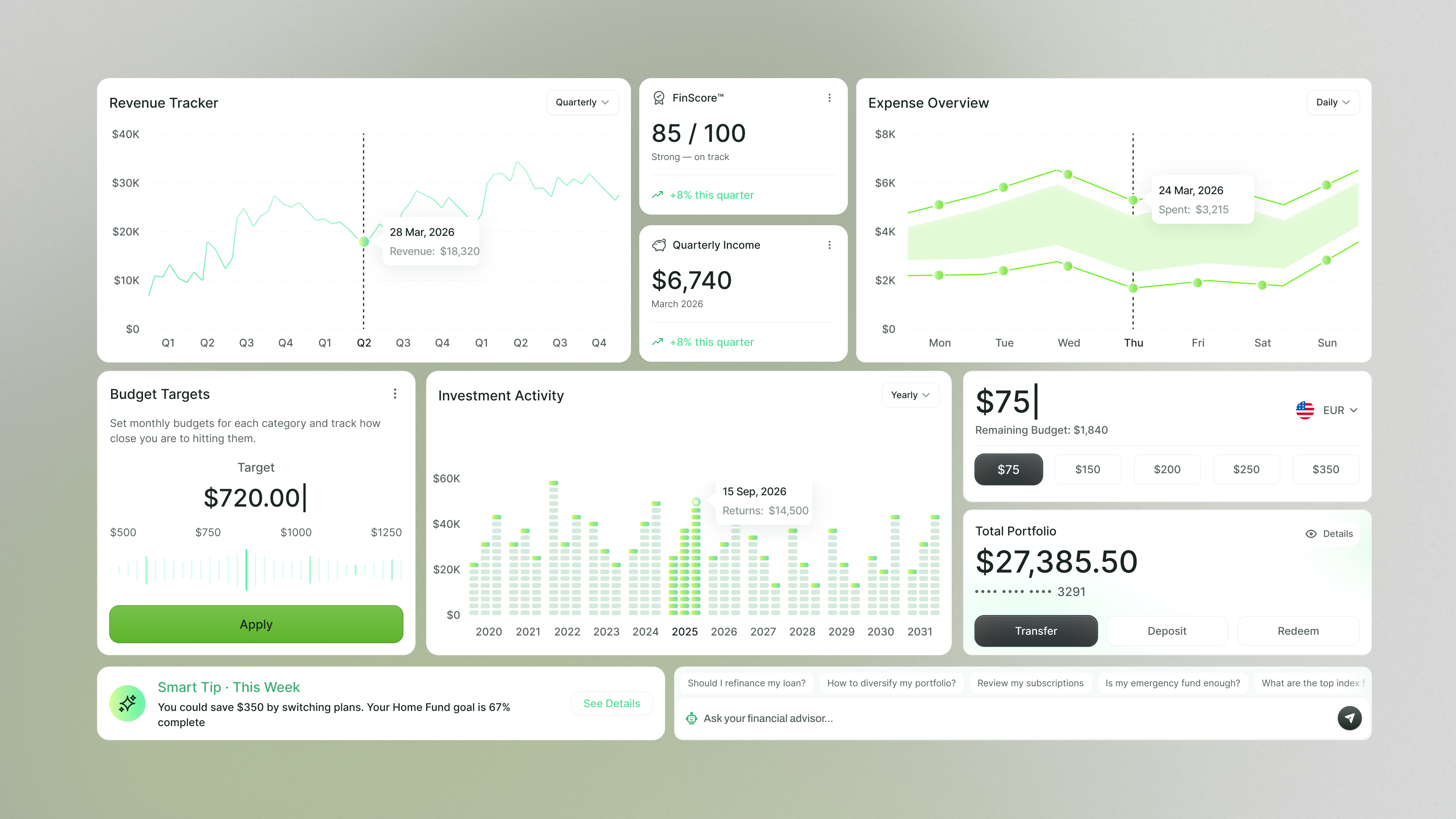
Personal finance dashboard with revenue, expenses, budgets, investments, and portfolio analytics
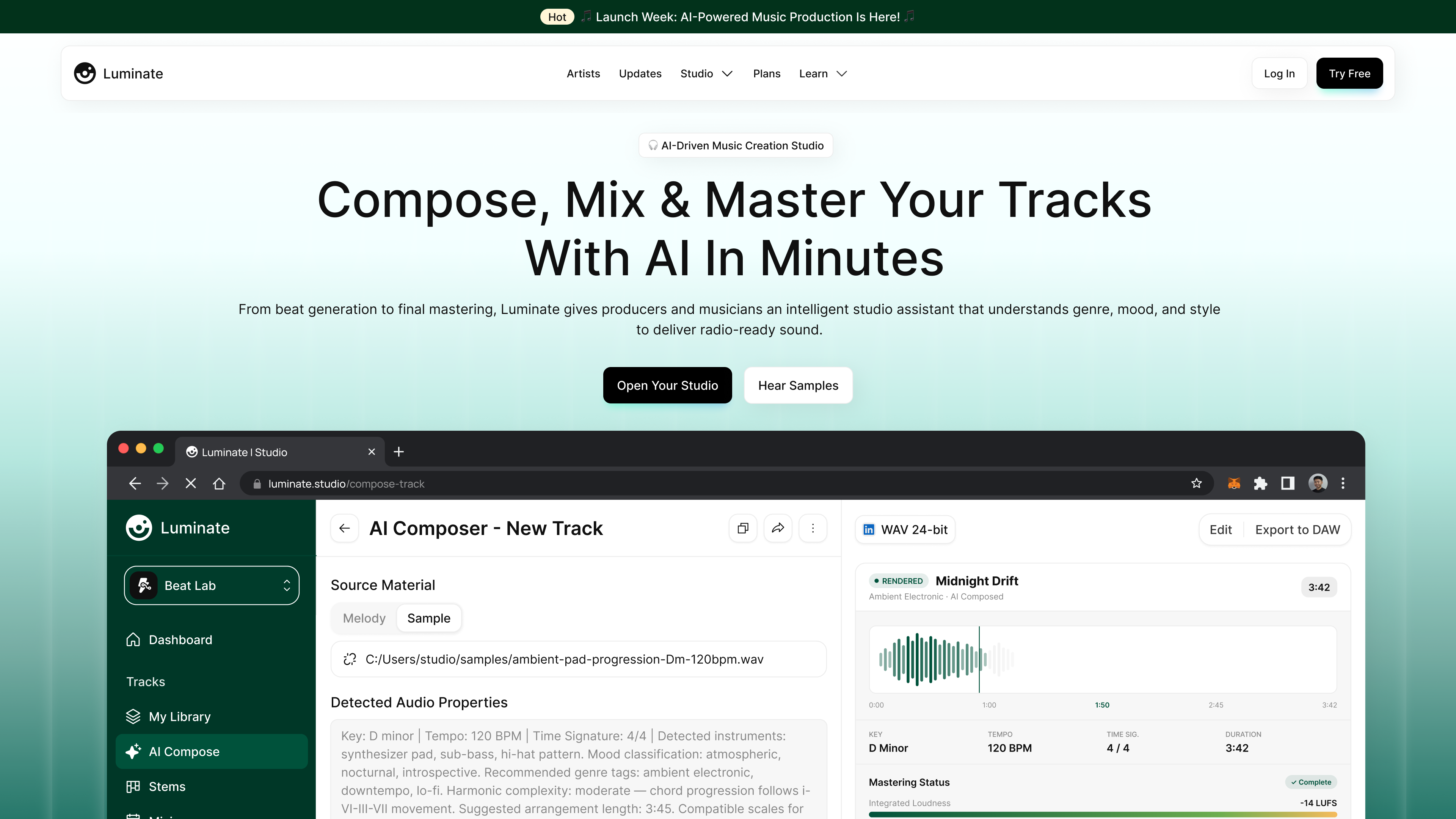
Luminate AI music production landing page and composer workspace
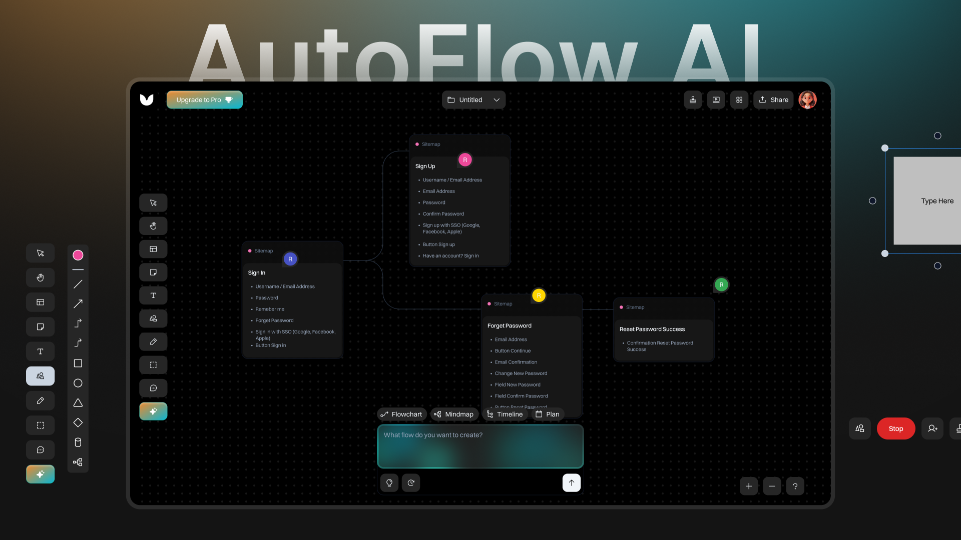
AutoFlow AI visual workflow canvas with flowchart tools, collaboration controls, and presentation mode
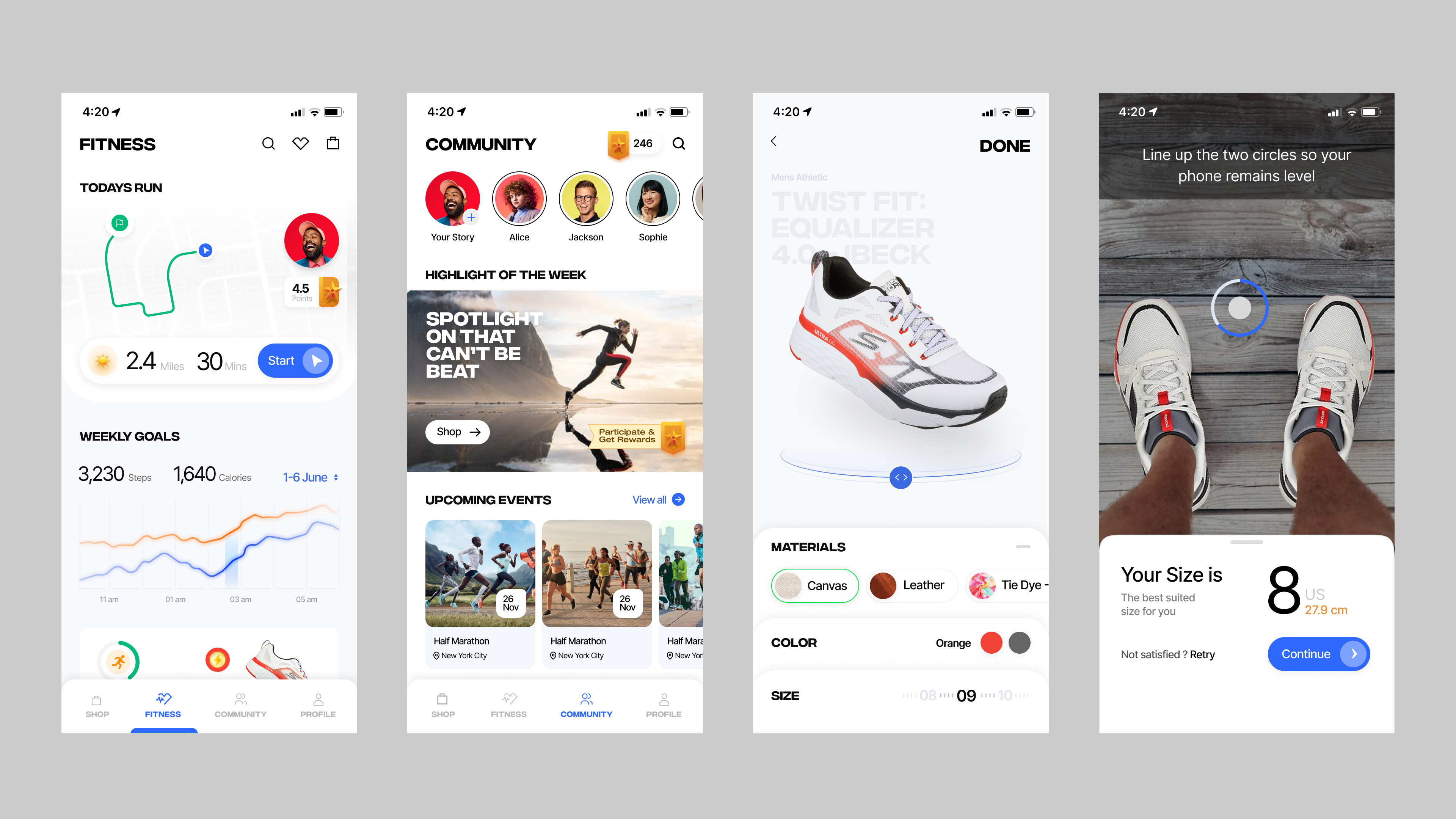
Mobile fitness and community product experience with run tracking, social events, 3D shoe customization, and camera-based sizing
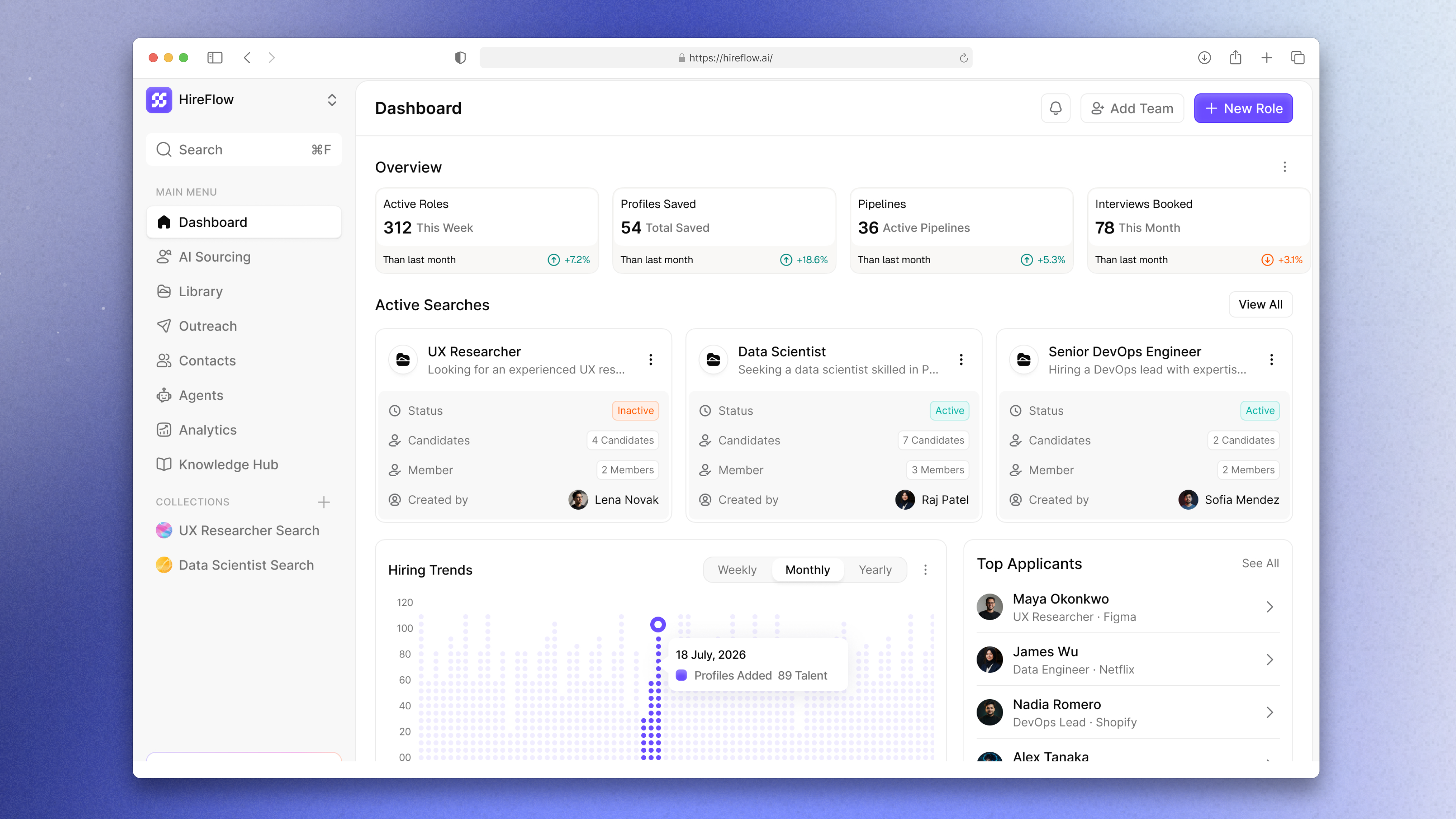
HireFlow recruiting dashboard with active roles, candidate pipelines, hiring trends, and top applicants
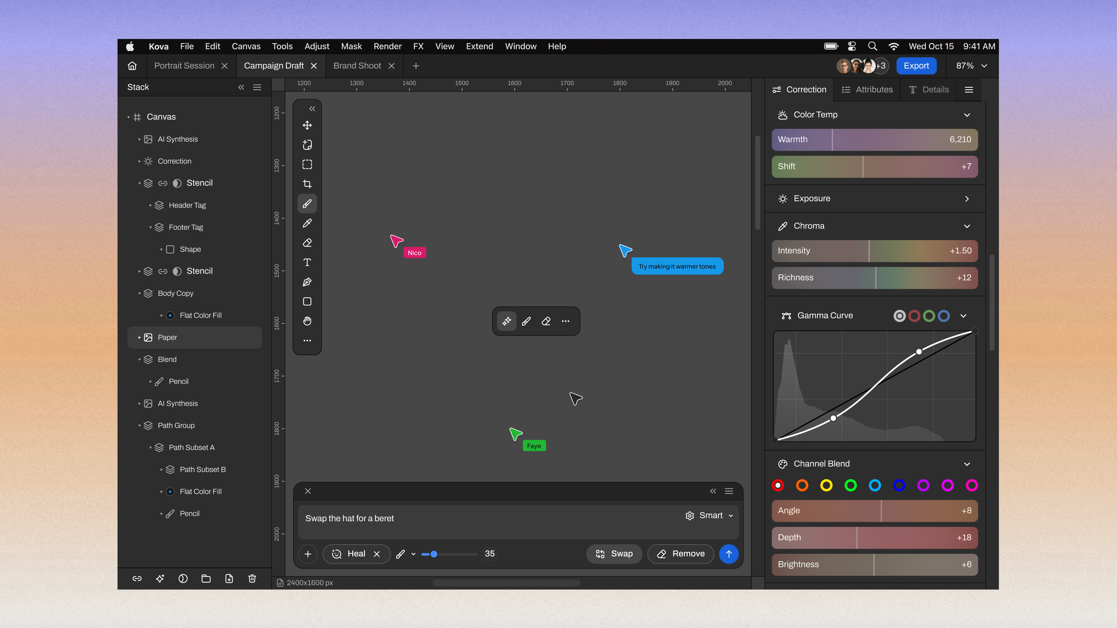
Kova collaborative image-editing workspace with AI synthesis, canvas tools, color correction, and live collaborator cursors
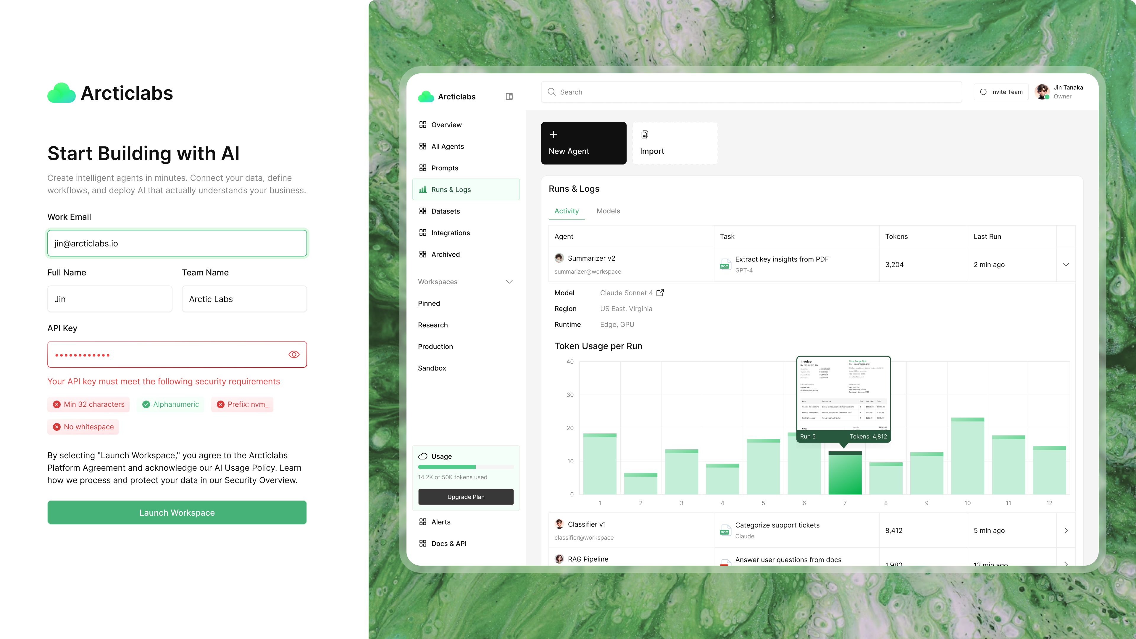
Arcticlabs AI agent platform showing workspace onboarding, agent runs, token usage, datasets, integrations, and operational logs
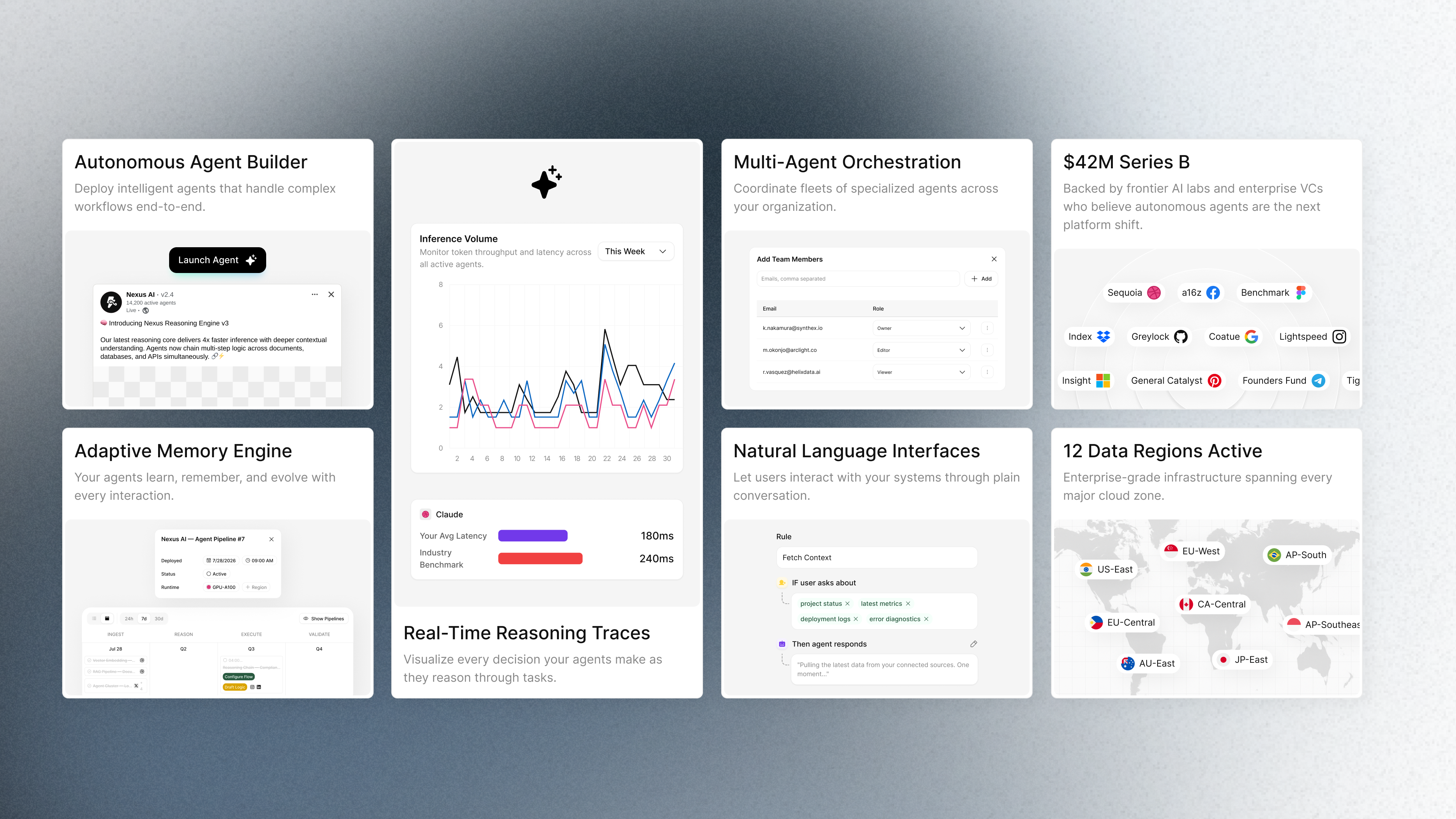
Enterprise autonomous-agent platform with orchestration, adaptive memory, reasoning traces, natural-language interfaces, funding, and regional infrastructure
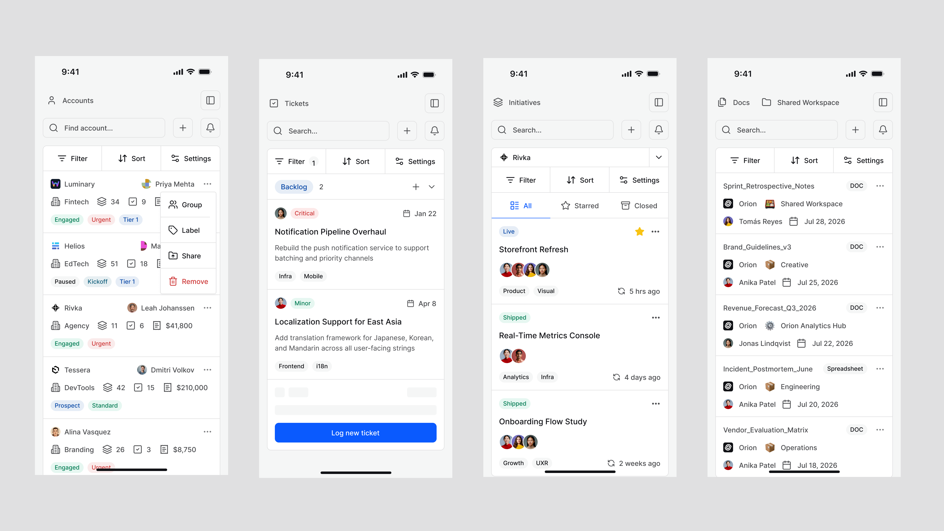
Mobile enterprise workspace screens for accounts, tickets, initiatives, documents, and shared collaboration
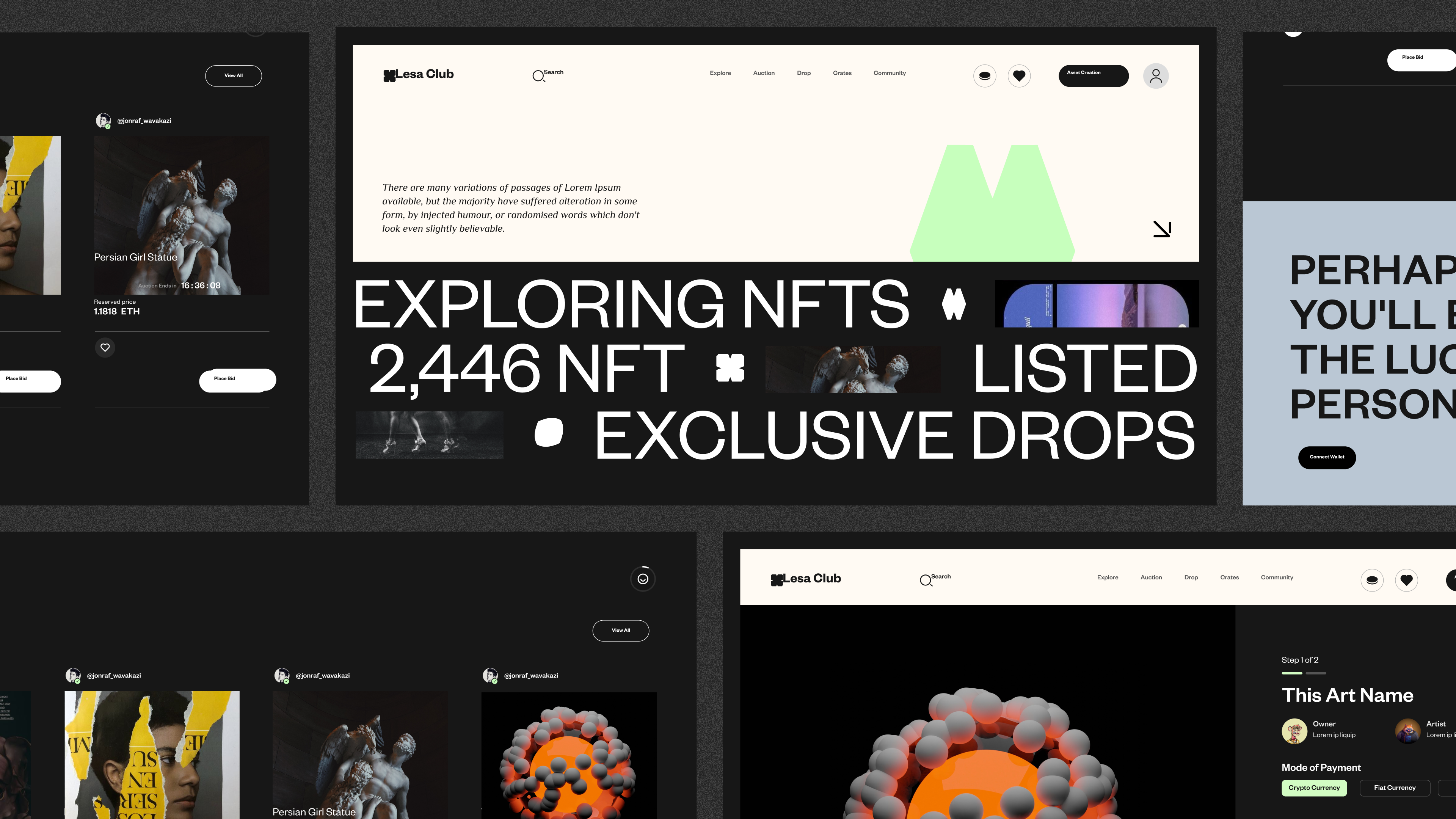
Editorial NFT marketplace interface with discovery, auctions, exclusive drops, wallet connection, and asset purchasing
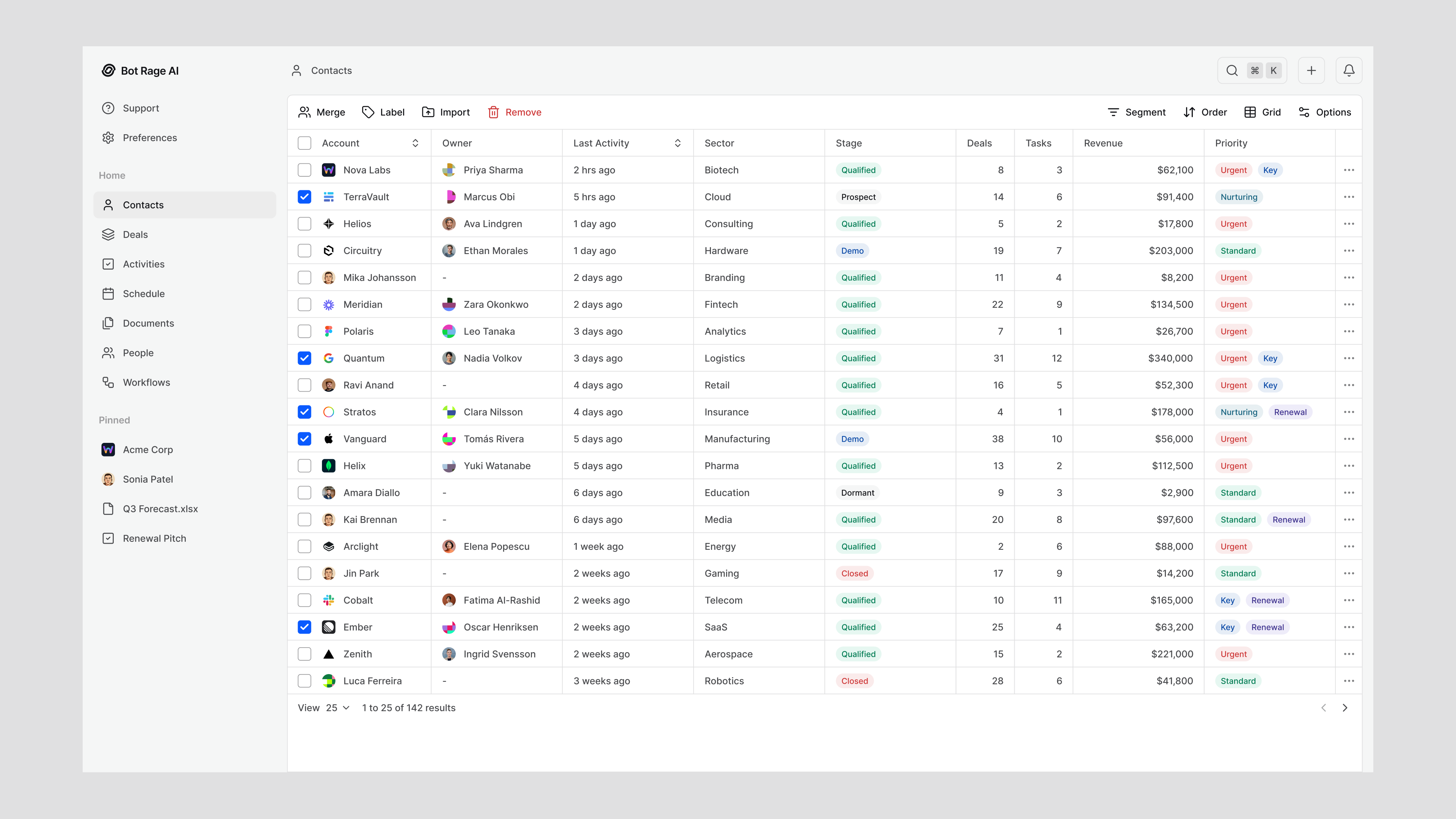
Bot Rage AI contact management workspace with account ownership, activity, revenue, priority, and segmentation controls
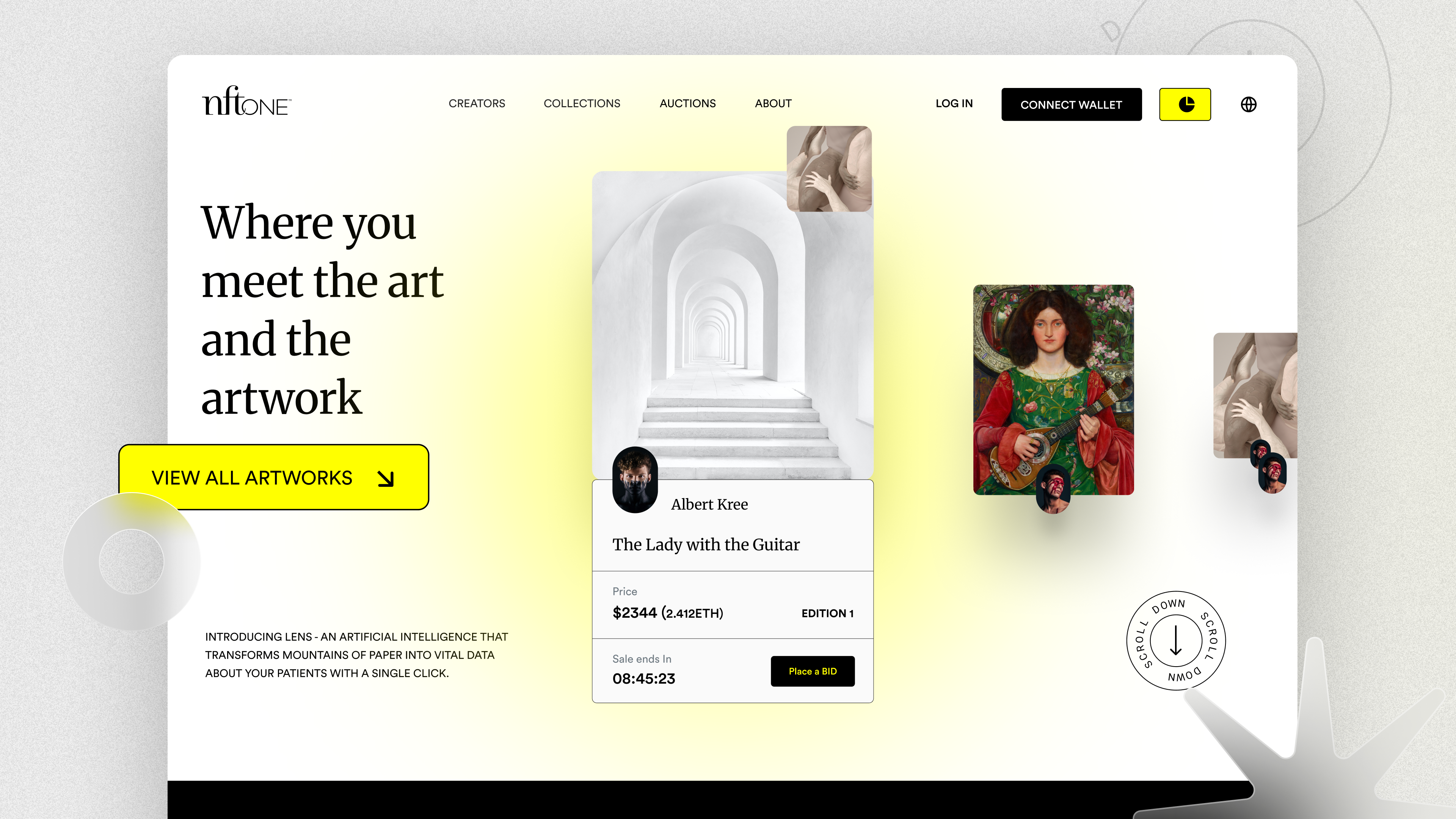
NFT One editorial artwork marketplace landing page with creator profiles, auctions, wallet connection, and bidding
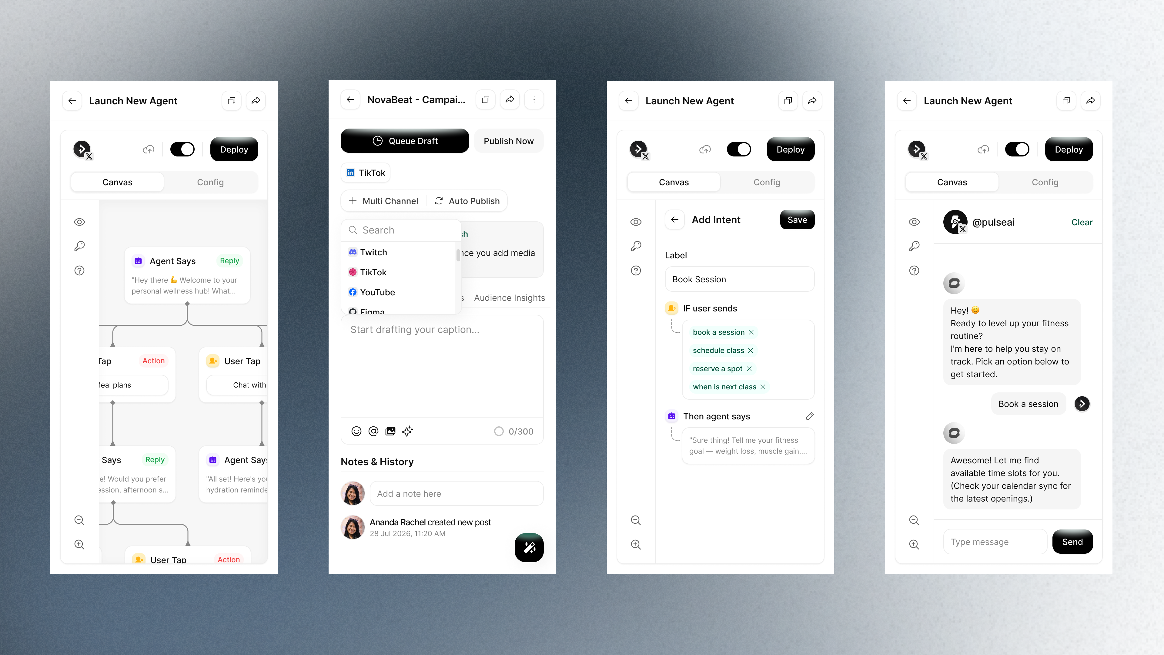
Mobile AI agent builder screens showing workflow editing, social publishing, intent configuration, and conversational preview
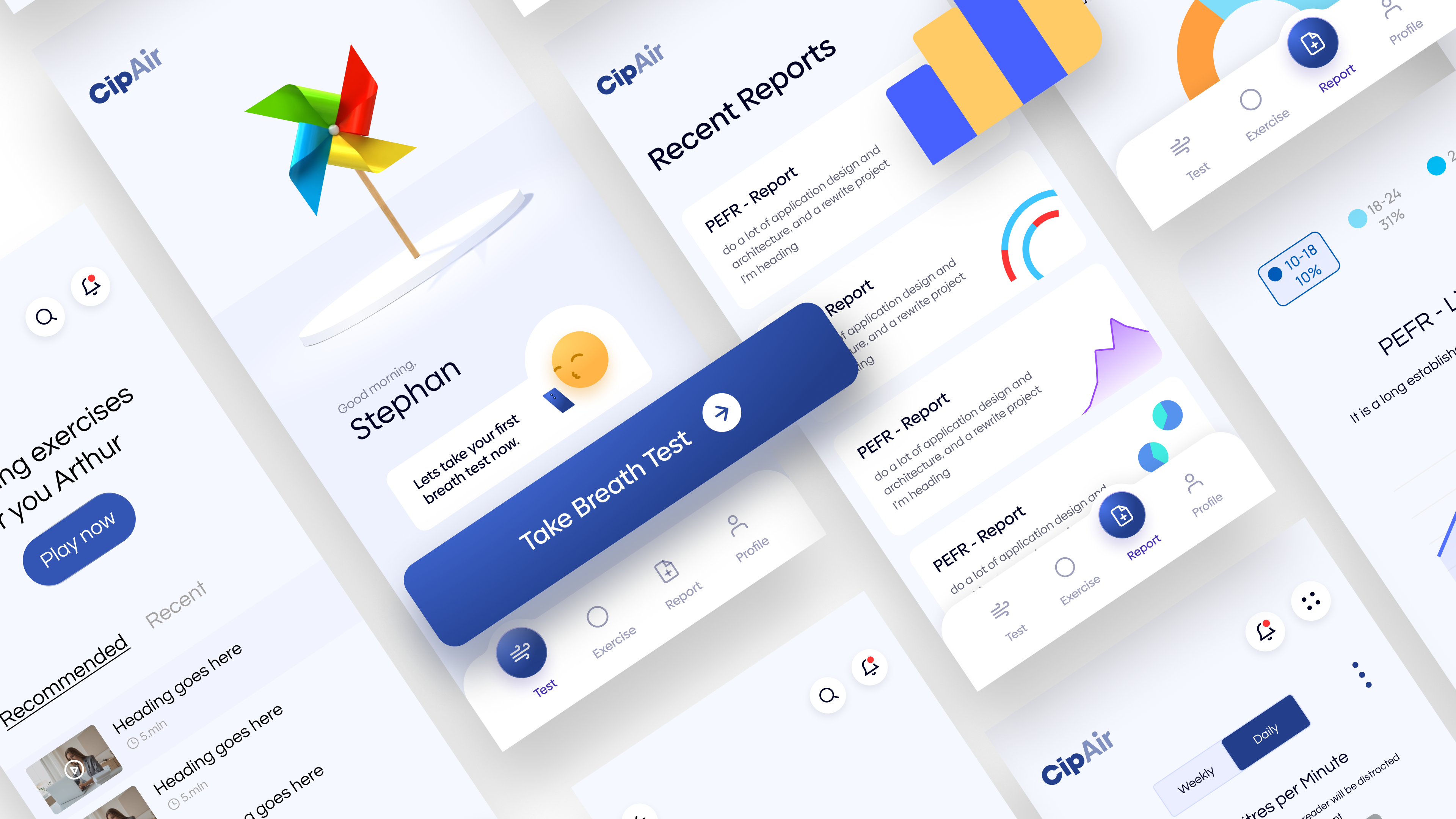
CipAir mobile respiratory health experience with breathing exercises, breath tests, reports, and analytics
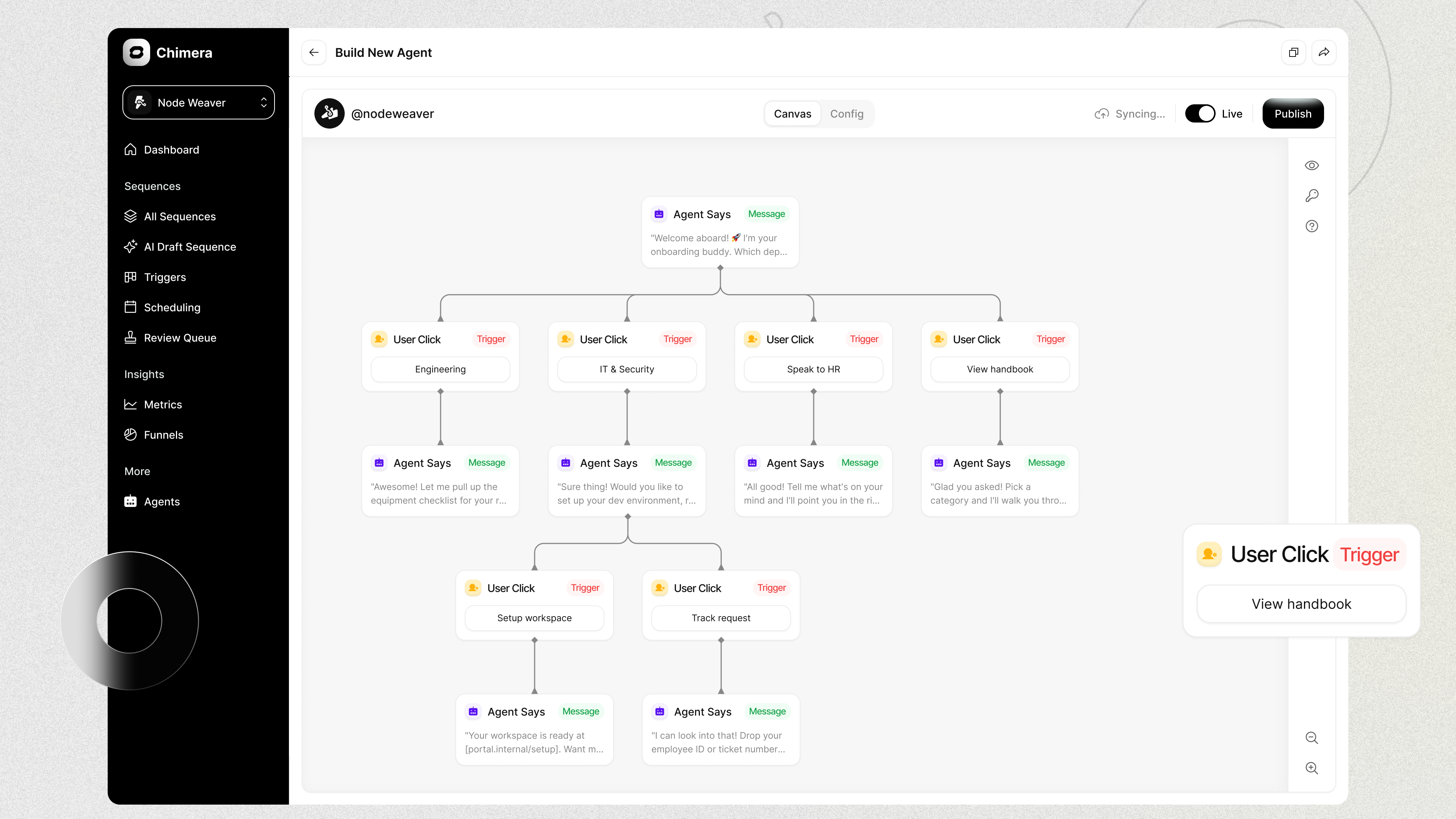
Chimera visual AI agent builder with branching onboarding flows, triggers, messages, scheduling, and publishing controls
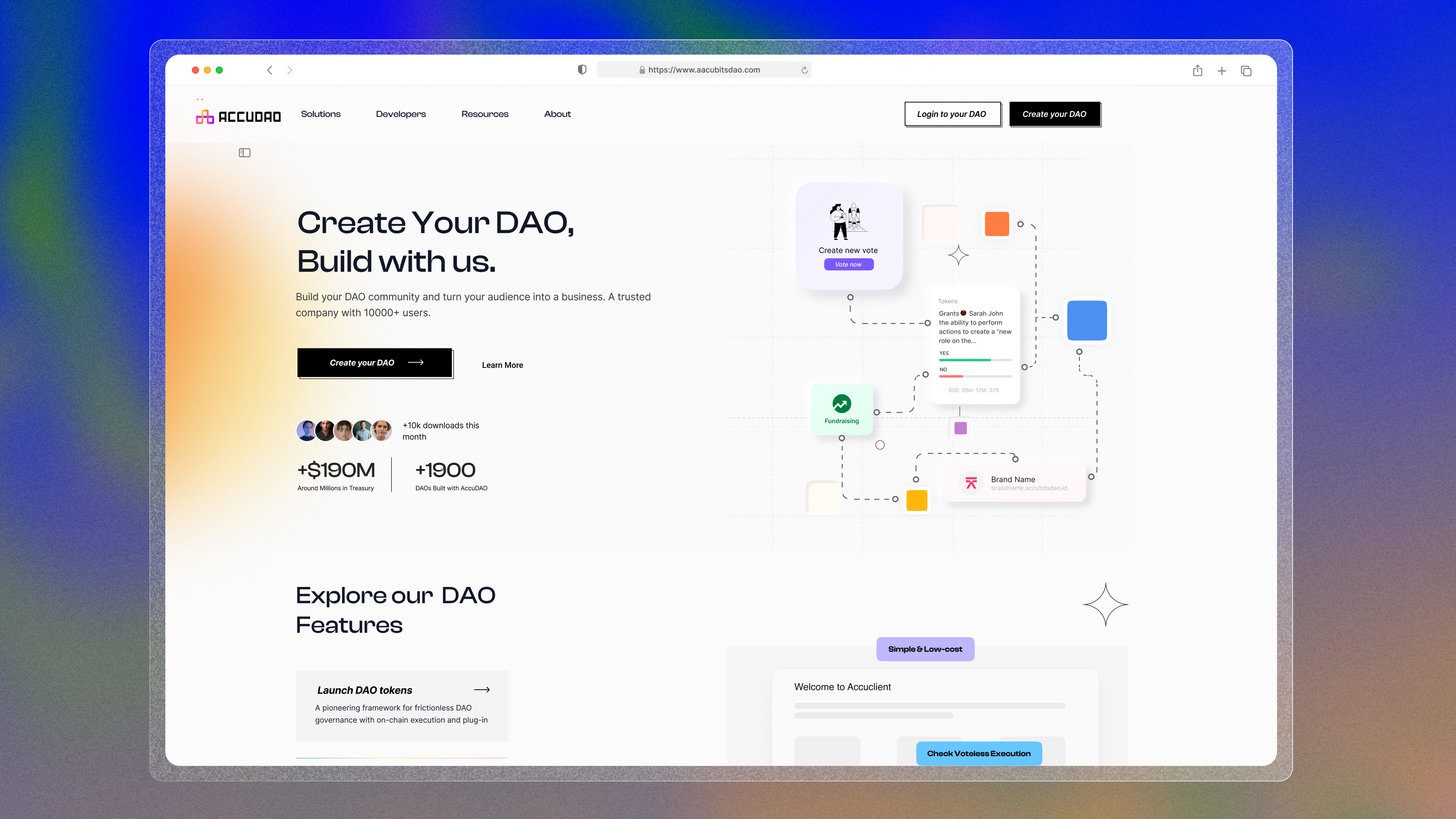
AccuDAO product website for creating and managing decentralized autonomous organizations
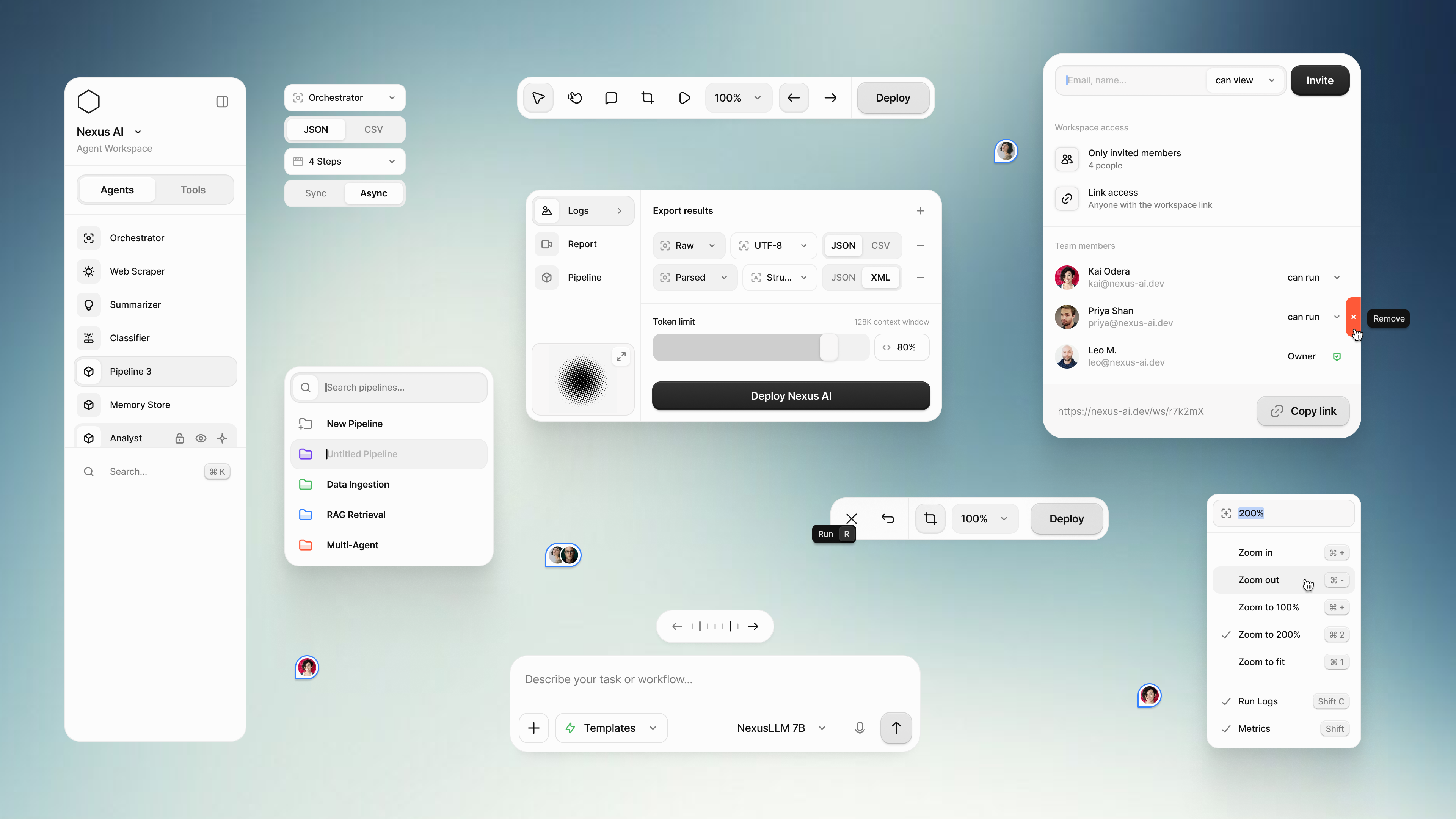
Nexus AI collaborative agent workspace with orchestration controls, pipelines, export settings, team access, and natural-language task input
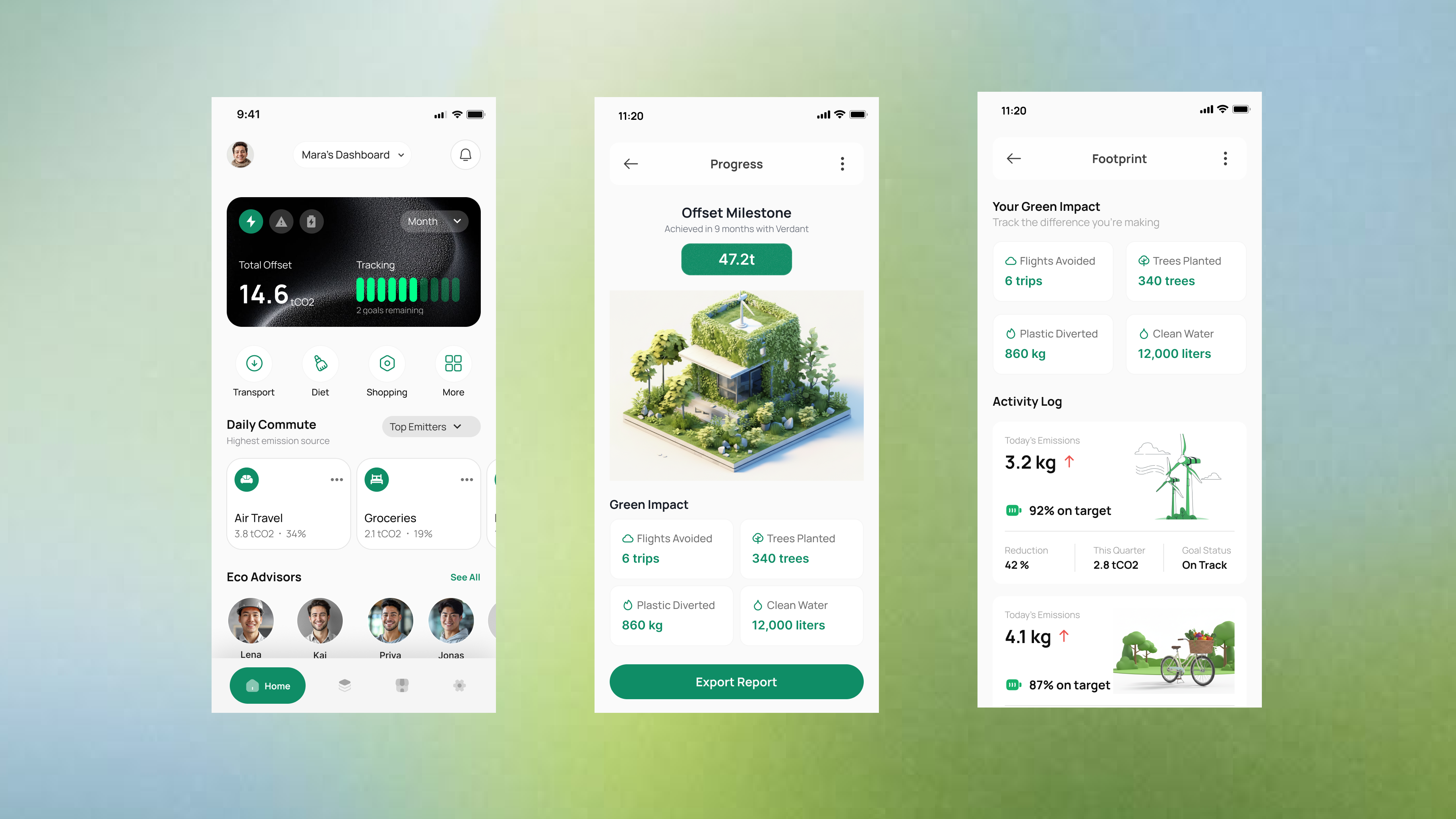
Mobile sustainability application showing carbon tracking, offset milestones, green impact metrics, and environmental activity reports

Resume · 2026

PDF · 1 page

Experience, leadership, and selected work

Download my resume.

A concise view of 12+ years across product design, AI, fintech, enterprise systems, and design leadership.

Download Resume PDF

Contact · Kuwait

Let's build something meaningful.

Have a project, idea, or collaboration in mind? I'd love to hear from you.

42%
MRead my Brain
inDb